


Creative Head at Penguin Random House India, Ahlawat Gunjan delves deep into the process of creating covers for books, the importance of associative capacity, and how experience and intuition help construct work that is strikingly appropriate and intellectually elegant.
What are you currently reading? Is there a work of writing you frequently revisit?
I’m reading Walks in the Wild by Peter Wohlleben, while Keeping an Eye Open by Julian Barnes and The Healing Magic of Forest Bathing by Julia Plevin eagerly await to be picked up.
I’m a graphic designer, a book designer to be precise. More than anything, I read a lot of literature on design. There are several essays and anthologies on the subject of design that are timeless, and I go back to them every now and then. I really value the books coming from Unit Editions [in London] and Lars Müller [in Baden, Switzerland] among many other publishing houses.
You currently head the design department at Penguin Random House India, and have worked with several publishing houses in the past. How did you first foray into designing covers for books?
It was by accident in 2007, a beautiful one without any regret. My first job was with Hidesign in Pondicherry and I wanted to move closer to home. I was looking for opportunities in Delhi and then happened to work with Dorling Kindersley (DK). I was really enjoying the processes of book-making and image-editing, as well as managing large-scale book design projects. However I’m rarely satisfied, and then wanted to try my hand at designing a few covers for Penguin (which used to be right next door in Panchsheel Park in Delhi). I still remember how nervous I was when I asked my then Managing Director [at DK] Aparna Sharma and she was absolutely open to the idea. In fact, she was very encouraging. I worked on one cover and it turned out well and this was the starting point, so to speak. I went on to do four more covers and realised I really wanted to do this for a living. With tremendous support from both DK and Penguin, the switch happened and I made Penguin my home thereafter. My master’s degree at the Glasgow School of Arts was focused on publishing and I was extremely fortunate to intern at Lars Müller and later at Faber and Faber. This is how I ended up in publishing and honestly, I can’t imagine myself in any other domain of graphic design.
While it’s difficult to gauge what kind of cover design might make a book fly off the shelves, how much should a cover reveal or shroud?
It entirely depends on the subject matter and the target audience — this forms the primary lattice of design-thinking. Some briefs for designing covers offer the possibility of clever design solutions through type and imagery while some need to be more immediate, more accessible. It’s a collective call we take in terms of how we wish to position a book. This is also informed by the tonality of the text.
While the appropriateness of the overall visual — including both type and image — is paramount for me, I do strive to find ways and means to offer the message in layers, to arouse the reader’s curiosity, to allow them to come closer to the book, pick it up, read the blurb, and make the decision of buying it or not.
How do you go about working on the design of a cover when you receive a new brief? Does the work begin whilst the writing of the manuscript is still in progress? How involved are the author and editor in the process of designing the cover? Moreover, does every cover designer also have to be an avid reader?
As far as the process goes, we receive a detailed cover brief from our respective editors, with inputs from the sales team as well as the author. This brief also has the important specifications such as dimensions, format (hardback or paperback), number of pages and the budget. The process of designing the cover varies from book to book, depending upon whether it is fiction or non-fiction. As a rule, I read all the fiction titles to get into the skin of the characters, basically to get to the heart of the story, and then visual themes start emerging while reading. At times I start my research on the side, or then once I have read the book. A lot of work happens parallelly, as while reading the manuscript I might be going back and forth with the editor and the author. I like to align everyone’s visual vision as much as I can.
While there are suggestions for the cover from the editor, everyone is always open to something unusual or new. I like involving my editor and author very much as I’m a firm believer that design is a collaborative process and cannot happen in isolation (I only paint in isolation, which is only for me). Here I am not talking of asking for approval on colours and fonts but to discuss and arrive at a collective vision regarding the primary message that we, as a publishing house, wish to convey as this would then help us position a certain book in the market. Since you are lending a visual character to an author’s hard work over years, involving them is undoubtedly respectful. I like to receive inputs from my sales team and the retailers too.
However as a designer, it’s your experience and intuition to edit or filter all of it into something strikingly appropriate and intellectually elegant. My method is slow, simple and uncluttered, as there already is enough visual pollution both in typography and imaging. Both of these are an art and a science and one should strive for simplicity.
It’s an absolute bonus if the cover designer is an avid reader — it makes the entire process so much fun, engaging and rewarding. I feel if the designer has read the book, their arguments and negotiations will be far more informed and educated.
You studied at the National Institute of Design in Ahmedabad and later at the Glasgow School of Art for your Masters in Graphic Design. How were these experiences different from each other? How important is formal training when it comes to creating book covers, or perhaps having a mentor?
How I wish I could go back to both my schools! If I have to talk about both separately, I would say the National Institute of Design gave me the foundation in design, an understanding of what rigour is, what entails quality, confidence and above all the ‘designerly’ curiosity.
I think I was left with a few unanswered questions (purely because of my introverted nature; NID isn’t to blame) and wanted to dig deeper and hence went on to do my Masters at the Glasgow School of Design. This was a therapeutic experience — full of design philosophy, amazing tutors who instil courage to take risks, to fail, to fall, and have conviction in what you do. I truly feel privileged for having those experiences, and the kind of individuals I met on the journey.
While accidents are beautiful, I believe it’s good to know a few rules of the game, if not all. Formal education offers these tools — design theories and principles, a trained pair of eyes, a sane head to think objectively and a heart full of courage. However, it is totally up to you, what you make of them.
Where do you otherwise find inspiration? Do you tend to revisit past work to spur your imagination?
Past works are like old clothes I have grown out of. It’s a great reminder of your journey, but I’m not sure if I look at them for inspiration. With our daily experiences, I think we grow every day — it’s ‘a new me’ every day, far more evolved than yesterday.
There are a few designers and thinkers whom I absolutely adore for their work and who they are. I keep myself updated about their work, how and what they think in this constantly changing world. From a visual perspective, I like attending exhibitions in India and abroad to connect with new people and to be surprised. I also read a lot of books on design thinking, culture and the arts.
You’ve designed covers for novels, works of historical fiction, fantasy fiction, poetry, and anthologies of short stories. Is there a particular genre you’re keen on exploring with cover design?
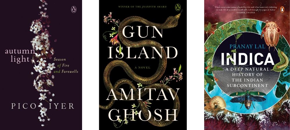
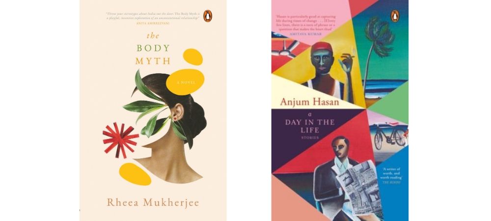
Yes, and I’ve also designed titles for Puffin, which is the imprint for children’s books at Penguin, such as Ruskin Bond’s The Room on the Roof. My favourite remains works of fiction and I’m usually very interested in the period of the British rule in India. One possibility could be that I’m myself a Midnight Child [born on 15th August at midnight]!
The building of a narrative through type is perhaps equally important as the visual. Could you give us a glimpse into the process that entails the selection of the fonts that we, as readers, finally see on the covers?
The author assigns a certain voice to their characters in the book. As a book designer one has to assign visual voices to those characters so you can understand what a narrative can do without a voice, or if it has the wrong voice. For instance, a book on war cannot afford to have a lyrical font. The relationship between the cover design and the text is very special. This is because a font, colour or layout is not chosen solely in function of its legibility but principally for its associative capacity. It’s the backbone of a good cover and I strongly believe in it. In fact, I completed an intensive typography course at the Royal College of Arts, London recently.
What is the work process like while commissioning covers to illustrators? Is it largely collaborative?
We prepare a clear illustration brief with examples for the illustrators to refer to. There could be discussions around the brief and once we both are on the same page, we get a ‘pencil rough’ from the illustrator. You are walking a very fine line while commissioning an artwork owing to time, budget, expectations, revisions and so forth, and so we try to share the rough version with the author, the editor and the sales team. Once everyone has approved the rough and larger vision for the final piece, we request the illustrator to go full throttle.
Publishing houses give tremendous importance to book covers — at times the cover of the e-book is different from the print edition; covers are revealed on social media; the cover design for the book differs when the same title is released in another part of the world; there are re-jacketed editions of previously published titles. As the one creating the visual identity of the book, how do you keep in mind the aspects of sales and publicity, as well as recall value and of late, shorter attention spans?
The battles of a designer — who is primarily an artist, and has to combine aesthetic sensibilities with the demands of trends and reading habits and marry the two, art and (commercial) publishing of books — is to come up with what speaks to readers, stands out and sells. A cover designer needs to understand that the author’s work is linear but the images on the cover are associative. The challenge is to add layers through visual intervention with type and image. So apart from creating a structure, the designer can control the reader to read the book in a certain way.
Once upon a time, cover designers enjoyed the luxury of time and a singular format of the printed book. Today one has to keep numerous variables in mind before getting down to the drawing board. Starting with the way one would approach the cover design brief, from image research, to figuring suitable typography to work across the platforms of print and digital, to production values while maintaining the strength and clarity in a book cover — all of these have undergone a seismic shift. While designing the cover for the print edition, the designer needs to keep in mind the modalities for the e-book cover too, as this will be viewed as a thumbnail on the app. The question to ask here is: in those smaller dimensions, will it still allure the readers? There have been instances where we have tweaked the print cover for an e-book for it to stand out, by strengthening the typography so that it works at a smaller size, while keeping the original cover image for the print version. This process could be both rewarding and frustrating at the same time.
The spine of a book plays a pivotal role as well, and designers must pay heed to that aspect. Because of decreasing shelf space, a month after the book is out, a retailer might place it vertically, where all one can see is the spine that’s an inch or two wide. However, it should still speak to the reader. It is a modest but important component, as it can showcase the essence of the book.
You spend your time painting as well. What, for you, is the interest in collaboration [with cover design] versus working individually?
These are two very different hats you are talking about. When I paint, I paint for myself, keeping myself as the end user. I don’t necessarily seek feedback as I’m doing it in response to a personal calling, trying to bring out my experiences and expressions through my paintings.
But when I wear my ‘designer hat’ during the day, I very well understand the core definition of ‘design’ that is made for an end user that isn’t me, but hundreds of other readers. I’m also aware that I possibly cannot design without external help (such as from the illustrators, photographers, calligraphers). While designers have the vision, they may not necessarily have all the skills to execute it themselves. The gift they have is to envision something and the roadmap to get there. So having an appropriate illustrator/photographer/typographer is half the job done for a book designer. Seeing someone helping you shape your idea is quite a satisfying experience, but it could be the exact opposite too!
If you could name three books whose cover designs have stayed with you, which ones would they be?
The first one would have to be Weaving a Metaphor by Sheila Hicks, designed by my absolute favourite Irma Boom. Second, the gorgeous The Flame Alphabet by Ben Marcus, designed by Peter Mendelsund. The third one would be The Craftsman by Richard Senenett, designed by Coralie Bickford Smith.
(Note: When you buy something using the retail links in our stories, we may earn a small affiliate commission.)


