

You are, at this very moment, reading text on a screen in front of you that I typed on mine. The letters in front of you made their way across devices and systems — sure, the internet and our computers helped out — but an international computing standard called Unicode is largely the one to thank for making sure what you’re reading is exactly what I typed (along with my editor’s tweaks, of course).
Understanding Unicode
Set up in 1991, the Unicode Standard provides a unique code for every character. These codes are then used to process, store or exchange characters, and ensure that any textual information you share with someone — regardless of what script you use — will be received exactly as you sent them. Latin capital letter A, for example, is encoded as Unicode character 0041, so every uppercase A that is typed — no matter what screen, printer or typeface used — will appear as the letter A.
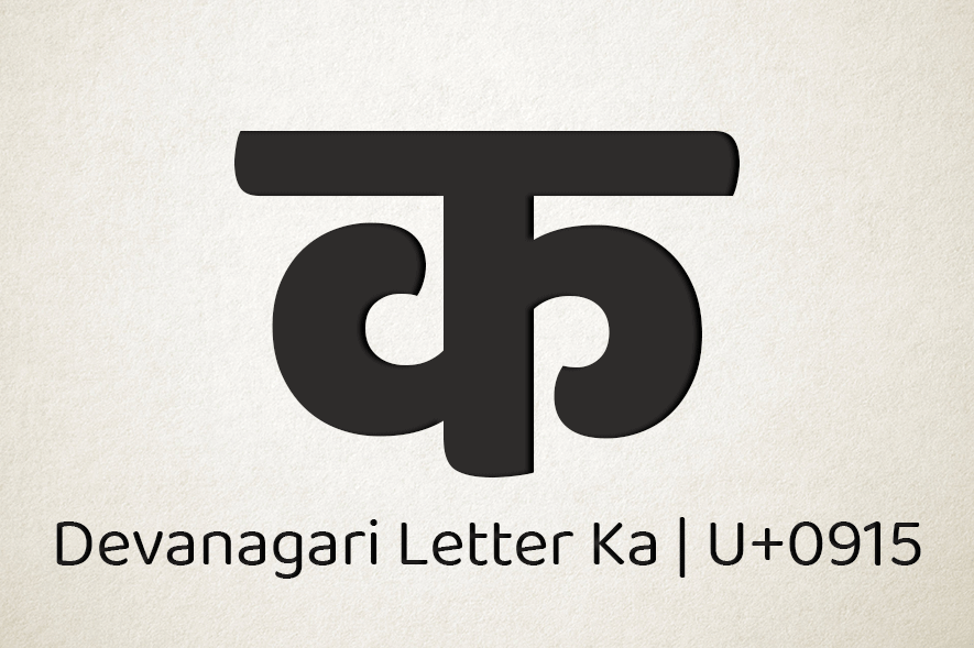
The most recent version of the Unicode contains 1,37,994 characters covering 150 modern and historic scripts, as well as multiple symbol sets and emoji. Every major Indian script — Devanagari, Gujarati, Telugu, Bengali, Oriya, Kannada, Gurmukhi, Tamil, and Malayalam — is part of the Unicode which guarantees that the languages employing these scripts can be used to send WhatsApp forwards, write books and create websites. But for typed languages to be transmitted and comprehended, they also need to be visually represented by a typeface. This is where Indian scripts have some catching up to do.
Type Concerns
The number of typefaces available to express regional Indian scripts is limited. Devanagari, used to write Hindi and Marathi, is likely to have the highest but that’s still nowhere close to the exhaustive Latin typeface variants that give English — and other languages that use it — options for voices and flavours. On Google Fonts, a popular database that has 922 typeface listings, 44 support Devanagari, while scripts like Tamil and Bengali have a mere nine and five typeface options respectively. Ol Chiki, the script that is used to write Santali, has a single typeface, created by Delhi-based type designer Pooja Saxena.
The need for Unicode-compliant typefaces in India is relatively new, given the proliferation of mobile phones in smaller towns and villages. More typefaces for regional scripts would benefit this diverse audience that’s now widely engaging with technology. It would also give brands and advertisers a larger gamut of design options with which to communicate with the people. Case in point: the same Devanagari typeface is being used to sell both life insurance and masalas.
One of the reasons there are fewer fonts for Indian scripts — despite the size of the audience reading these scripts being many times that of the widely-designed-for Latin script — is because of its complex writing system. Those familiar with Devanagari, for instance, will know that its vowels can be used as independent letters or as modifiers via maatras placed above, below, before or after a letter. Consonants, too, can be modified. What this means is that even though Devanagari is assigned 128 spaces in the Unicode, it takes around 600 letterforms in a font file for it to be a decently designed. That number could even run into four digits depending on the details and richness of the design. It’s easy to imagine then the amount of time and effort that goes into designing a single typeface, especially for complex Indian scripts.
Getting it Right
Despite the challenges, a crop of typeface designers in India are creating new typefaces for these regional scripts. For Saxena, it’s important to define the purpose of the typeface before designing it. “Will it need support for specific languages? Do these languages have specific forms of letters or conjuncts that are preferred over others? Are we expecting the typeface to be used to set texts that will use a lot of foreign words?” she asks. Questions like these help her work out what kinds of conjunct combinations the typeface would support — which directly impacts the character set and the number of letterforms needed. Rob Keller, of type foundry Mota Italic, follows a similar approach. His foundry also defines the purpose and possible uses before beginning to design a typeface. “The design depends on the brief,” he says. “In the case of a self-initiated project, the foundry might design something that serves a common trend or fills a gap in the market.”
Knowing how to read the script you’re designing for is a plus — but making a typeface always requires tremendous research. Kalapi Gajjar-Bordawekar, co-founder of typeface design studio Universal Thirst, explains that while designing for Gujarati, his native tongue, he made an extensive excel sheet of possible letter combinations which then got edited manually to remove sounds that are unpronounceable. “Initially, [the foundry] referenced existing analog and digital typefaces to build a singular data set, but we now have an in-house archive that gets updated regularly,” he says. Keller too tests for as many possible words and letter combinations to figure out exactly which and how many glyphs will be needed. Apart from linguistic aspects, there are technical considerations that affect decisions regarding the character set as well. Saxena, for instance, points to considerations about whether to include precomposed conjuncts, or to build them using full and half forms. After these decisions are made and a design is drawn, a good typeface goes through rigorous tests to ensure it is top-notch, especially for the environment it is designed for.
Out in the World
As the typefaces for regional scripts are few — it’s hard to put a number on it — the number of Unicode-compliant typefaces available are also not significant. Among the multi-script Unicode-compliant designs out there, Baloo and Mukta by EkType and Poppins by Indian Type Foundry are the most popular. The latter currently holds second place on Google Fonts. But apart from anecdotal evidence, it’s hard to verify whether these popular fonts are actually being used for regional languages.
In order for this market to grow, an audience that uses and pays for good quality typefaces is essential. Corporate branding is a good place to start. Institutions like Starbucks and Raymond have contributed well in this regard, incorporating custom designs of local scripts into their visual identity depending on which city they are in. Indian Type Foundry’s Kohinoor typeface for Devanagari, Bengali and Telugu are licensed on iOS devices, which makes them appear frequently in designs as they’re easily accessed as system fonts by designers. Star TV’s network of regional channels, for instance, is an example that uses the Kohinoor fonts in its identity design.
At the end of the day, multilingual branding makes establishments more inviting and accessible. Good quality type on products and services should be script-agnostic — creating a demand for this will ensure we have more options at our fingertips. According to Gajjar-Bordawekar, “the typeface design and consumption ecosystem for Indian scripts is at such a nascent stage that I would consider most contributions an inherent success. Maybe I’ll change my mind when we have 100k Devanagari typefaces.”
Perhaps the day when there are so many fonts that designers are spoilt for choice and can even play favourites is the day we’ll have succeeded. When a design for Bengali is as polarising as opinions on ‘Helvetica’, or when the ‘Comic Sans’ of Telugu makes someone roll their eyes. Maybe once typefaces start being cherished — or despised — with the kind of ferocity reserved for Latin typefaces, we’ll have enough diversity.
Author
Tanya George is a type designer and typographer based in Mumbai. She is on Instagram and Twitter as @tanyatypes.
Tell us what you think? Drop us a line.


