Bhubaneswar was the last city I got to visit in my pre-pandemic life. I was accompanying friends who were exploring Odisha for its culinary offerings. Being the capital, Bhubaneswar — with its highly recommended spots for Odia cuisine and being a good base for day trips around the state — formed the focal point of our trip. Of course I also had my own agenda to document as many interesting Odia letters I could. Lucky for me, signboards require no detours.
Before the trip, I wasn’t very familiar with the script — my knowledge of Odia came from what showed up when I googled it. These were mostly fonts with bulbous letterforms. I found that, much like Tamil and other south Indian scripts, this round shape is because Odia used to be written on palm leaves which would tear if there were too many straight lines.
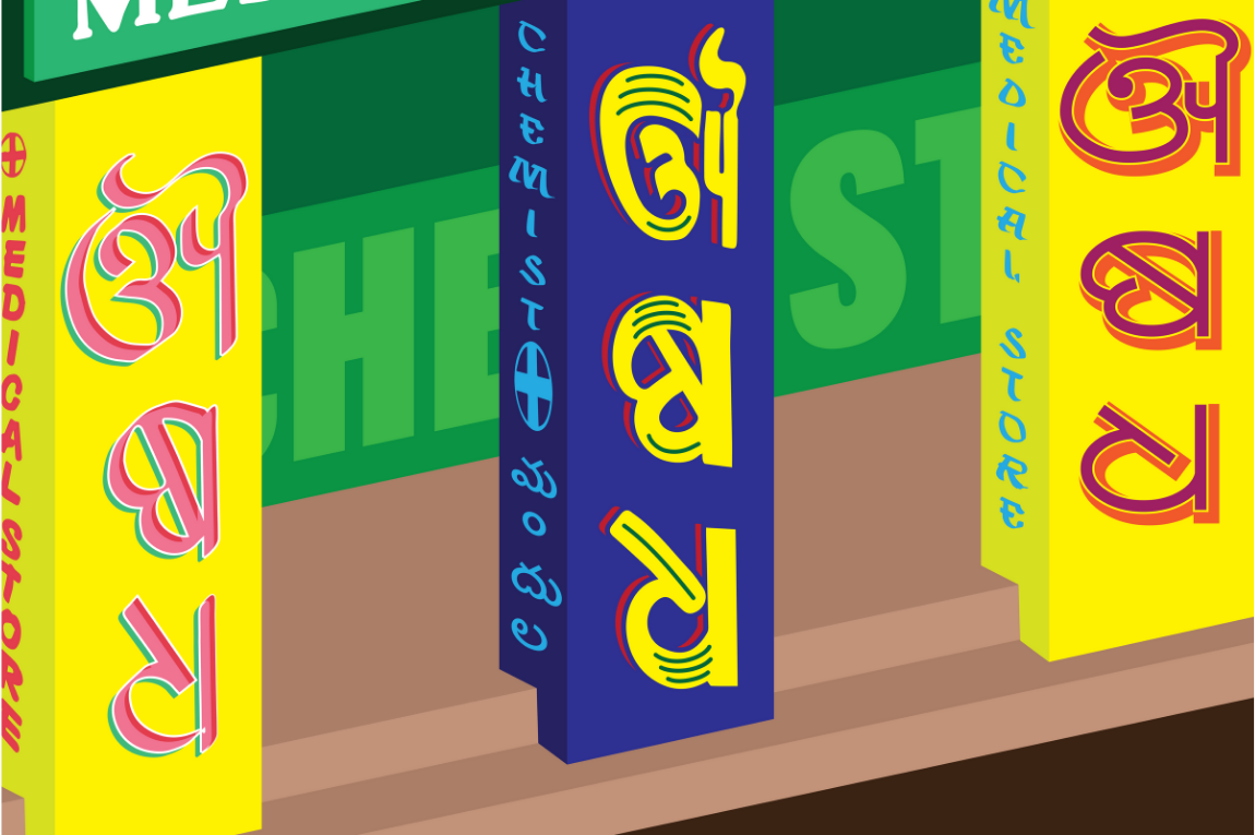
In Bhubaneswar, I got to see many of these rounded letterforms in person but was delighted to spot other ways to write Odia too. Especially popular were squarish letters that allowed the text to be bold, large, and take up maximum space inside limited surfaces. Sometimes, letters in a word were stacked like Tetris blocks on pillars. Now that Odia could be written on material sturdier than palm leaves, lettersforms with geometric constructions and point tips could also be seen.
As I photographed signs, I also got better at identifying Odia letters. I realised that pharmacies, for instance, have the same word on their storefront in different styles. ଔଷଧ — aushadh, or medicine — has a distinct first letter that I started recognising even before seeing the English sign. I spotted delightful renditions of letters from the English alphabet, a reminder that creative license often allows a glimpse into the personality of the person painting these letters. I also saw signs on lodging houses in Bengali and Telugu, targeting travellers from Odisha’s neighbouring states.
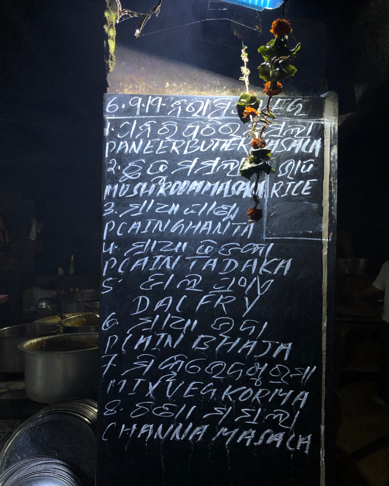
On our culinary expeditions, which involved a lot of waiting for and between meals, I busied myself by taking pictures of signboards and menus. A lot of the smaller establishments had a limited oral menu, but many also displayed handwritten chalkboard menus that showcased a cursive form of Odia.
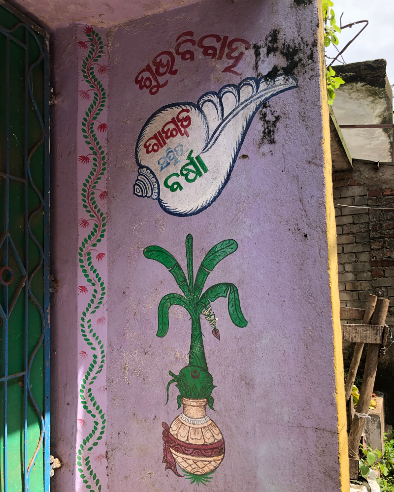
By the end of this trip, I realised that type-spotting made me feel less alienated in a new place. It helped me picture the lives of the people who got these signs made. I also came away with my personal favourite kind of sign. Outside many houses, near the main door, I spotted hand-painted, beautifully decorated signs with the names of a couple getting married. A newly formed Odia friend informed me that this was a tradition in some parts of the state — before the nuptials, family and friends decorate the doorway and write the couples’ names, which then stays on to serve as a sort of nameplate on the threshold. A pleasant reminder that a closer look at even a simple sign can reveal so much more.
Author
Our selection of stays across India, best visited for their design and style. Check in
Tanya George is a type designer and typographer based in Mumbai. She is on Instagram and Twitter as @tanyatypes.