

With See This, we’re diving deep into our unabashed love for good design stories. Here, graphic designer Kawal Oberoi hones in on interesting and innovative visuals in our everyday surroundings, and chats with designers behind the work about details that may otherwise pass us by. Take note.
Last year, the Ministry of Health and Family Welfare launched Ayushman Bharat, a national health and wellness scheme, across India. The scheme aims to address healthcare holistically by creating interventions in primary, secondary and tertiary healthcare systems. Under the Ayushman Bharat National Health Protection Mission, 1,50,000 centres are to be set up to provide comprehensive healthcare — for non-communicable diseases, and maternal and child health services — in addition to free essential drugs and diagnostic services.
Delhi-based Lopez Design was commissioned to create the visual branding for the health centres launched under this scheme. We spoke to the studio’s founder and principal Anthony Lopez about the challenges of creating a cohesive brand identity for such a massive government scheme, and why simplicity was the solution.
How was your experience of working with the Government of India on this project? What is the general perception of design consultancy and branding among decision-makers in the government?
We got lucky with this project as it is a very prestigious one, and a pet project of the Prime Minister himself. In a very short timeframe, our quick decision-making and professional competence aided our concept presentation favourably. However, speaking from our prior experience working with the government, it is a challenging task, mainly due to the mismatch of perceptions of what design can do, the impact and the difference it can make. For them, it’s a beautification task and shouldn’t take up much time and investment. Bureaucracy and systems present other challenges, which are extremely tough to navigate. You are often encouraged to charge a lesser fee because a higher fee would entail more approvals, processes and time, further delaying the project.
But our experience of working on large complex projects with the government, along with access to top decision-makers to meet their urgent deadlines, helped fast track the process at unprecedented levels. In the past, we have worked on grassroots social projects for the World Bank, UNDP, UNICEF, and several other organisations. This has ingrained in us a deep sensibility about on-the-ground issues. These accurate insights helped us hone in on an appropriate solution.
Considering the fast pace of this exercise, what kind of brief did you receive for this project?
As far as I recall, there wasn’t a clear design brief. For the government, it was a prestigious pan-India initiative, touching and impacting a great number of people. They wanted maximum outreach to bring public health facilities to every last person in the country. In the context of branding, we were simply asked to create relevant and attractive graphics for the health centres that would appeal to the masses. We furthered and expanded this brief and its framework.
What were the key problems you identified in the project, what were your insights and how did you expand the brief?
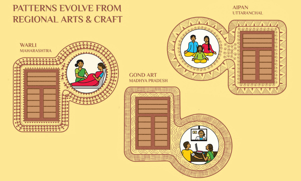
Right at the onset, the complexity of the task was centred on how to create a visual brand for such a diverse nation, where every region has a distinct culture, language, practice, et cetera. It dawned upon us that a ‘one size fits all’ solution is not going to work. But we didn’t know how to resolve this right away.
Another challenge was that each health centre building was different. There was no consistency as no two buildings looked alike, leading us to realize that creating a cohesive branding on the facades was going to be a huge challenge.
There was also this problem of people in villages, small towns and tribal areas having difficulty in accepting modern medicine and scientific approaches, as their age-old traditional methods come into question. Bridging this gap of acceptance became a challenge. The question we asked ourselves was: How do you make health centres less intimidating, more accepting and bring in a sense of ownership for its recipients?
After gathering the key insights, how did you approach the solution? Can you tell us about the key components and processes of the design system you came up with?
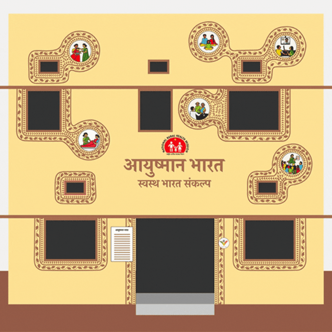
The idea of creating simple pictograms and illustrations depicting the main facilities came instantly, as this overcame language and script barriers. The visual branding which followed and got selected was pretty tame; we dreaded the thought of it being replicated over 1,50,000 health centres across the country!
I came up with a Eureka concept overnight — a design system that was craft-based and would involve the participation of local artists, using their ingenuity and skills, while adhering to some basic guidelines. Simply put, the system involved drawing parallel lines around a window or a door and filling in these spaces with patterns derived from local folk art. We provided the artists with a few examples, giving them guidelines and a colour palette based on mitti ka rang [the colour of the soil]. For the illustrations, we provided the artists with a grid for them to draw in the right proportions, the kind they’re accustomed to.
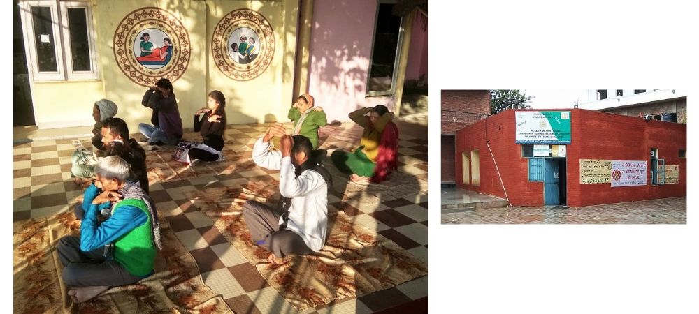
We already have hundreds of health centres painted — the process is still on and we are excited to see how 1,50,000 centres will pan out.
Making a system work on such a massive scale is not an easy task. How can one design a branding system that can adapt and scale rapidly without breaking down?
You simplify. The design is easy and simple to understand and implement by people with basic skills. In this project, we refrained from making too many rigid rules. Instead, we created a few guidelines which are easy to follow. We challenged ourselves to bring simple ingredients into the system, keeping in mind that the brand shouldn’t fail even if the painters fail to execute the system with precision. We brought an inherent flexibility in the system. The visual identity was anchored in elements at the macro level, which were larger than the nitty-gritty of precision.
When we started examining the outcome of this exercise, we noticed that even though the painters had broken the rules beyond our expectations, no harm was done. The results were still consistent and cohesive. Artists even customised the facial features and attires in the illustrations with their regional nuances. This added an extra layer of relatability and authenticity for our end user.
In addition, we created PDF guidelines, which were made easily accessible to all stakeholders by instant distribution through a messaging app. Given the timeline, it would have been a disaster to have to print and then distribute manuals for a project of this scale. This was a breakthrough, which saved the government tremendous resources and time.
From your experience of working on this project, what do you think others can learn from the unique approach you took? Should we see more branding projects employ this way of thinking?
This project is one of its kind in the world. I certainly feel we should see more projects in India approached in a manner that supports diversity and preservation of our very unique local cultures. This is extremely important for a nation like ours, as it celebrates our inherent identities. Even after ruling for about 200 years, the Britishers couldn’t flatten India. India is one of the few places in the world where local traditions and practices are still alive. But these days we are seeing a lot of these cultures getting wiped out due to the model of economic progress and growth that we have adopted. Brands, institutions and governments should be cognisant and act responsibly towards our diversity.
Author
Kawal Oberoi is an independent graphic designer, brand consultant and podcaster. He is on Instagram and Twitter at @thekawaloberoi.


