

With See This, we’re diving deep into our unabashed love for good design stories. Here, graphic designer Kawal Oberoi hones in on interesting and innovative visuals in our everyday surroundings, and chats with designers behind the work about details that may otherwise pass us by. Take note.
Hyderabad-based Dr. Reddy’s Laboratories is a multinational pharmaceutical brand that aims to enable access to high-quality medicines for all. A couple of years ago, the brand sought to reflect a patient-first philosophy in their packaging design. New Delhi–based Codesign was commissioned to create a communication design system for the lab’s Schedule-H drug packaging that would bring this new approach to the market. Here, Codesign’s founders, Mohor Ray and Rajesh Dahiya, take us through the whole process — from working in line with stringent regulations to ‘invisible craftsmanship’.
First up, what are Schedule-H drugs? What are the nuances of designing packaging for these medicines?
Schedule H is a class of prescription drugs in India, appearing as an appendix to the Drugs and Cosmetics Rules, 1945. These are drugs which cannot be purchased over the counter without the prescription of a qualified doctor. In India, Schedule-H drugs are marked by a thin red line and the ‘Rx’ symbol on packaging. They are governed by a stringent set of regulations in all aspects of production and distribution, including packaging and communication, for all the right reasons. But the problem is that the language around it is very archaic and ambiguous. The don’ts are unclear; and crop up unexpectedly when you ‘do’ something. Also, nobody was thinking about the visual design implications while these rules were being made. For example, if a rule dictates that a red line has to be ‘x’ mm thick, it works on larger boxes but when you proportionately scale it to smaller boxes, it doesn’t work.
When was the last time you saw an effort towards making something that looks different in India? Everything blends into this white-cardboard kind of packaging. Perhaps it’s the painful vagueness of these rules that are the reason why no one has gotten into it. And if you have decided to make a change, it is an expensive affair. So, nobody takes a risk. Plus, user experience wasn’t considered for a lot of these touch-points. Getting genuine and right medicine used to be (and to a certain degree still is) a struggle in our country. Providing access to medicine was considered good enough.
When a project of this scale is commissioned, clients usually contact multiple agencies before deciding which one to hire. How did Dr. Reddy’s decide to go with Codesign?
This project had an interesting beginning. Dr. Reddy’s invited us to show our work in packaging design to their team. We had very little work in packaging and absolutely no work for pharmaceutical companies. However, our focus is always around communication design, independent of the format that it will acquire. After our presentation, the client admitted that we did not have enough relevant work in our portfolio. They were also meeting other agencies. We could see the project escaping from our hands. So we went back to their meeting room and proposed to rethink the design brief itself — in a manner that addressed the problems at hand, rather than checking off a list of ‘implementation’ touchpoints. We felt that the existing brief merely demanded an adaptation of their recent rebranding in the packaging of the drug — it didn’t stress enough on communication design. The client loved our proposal.
In the following days, we made a highly detailed design brief, over four to five pages, of what this exercise should include. We suggested things like: learning from the field study, restructuring the existing content and deployment of the design system at a rapid pace. Later, we were asked to present the brief to the client’s team. That presentation convinced the client that Codesign knew how to tackle the problem of communication design, and that’s how we secured the project. In fact, the project title ‘Communication Design System for Dr. Reddy’s Schedule-H Drugs’ is our contribution to the project.
What were the unique challenges you identified while working on this project that you could address through design?
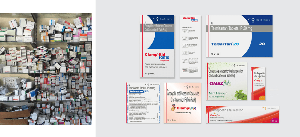
We worked closely with the client and outlined five project challenges. The first one was creating differentiated brand recognition and recall. The second one was identifying all the opportunities for enhancing the clarity of communications. This comes from the new brand philosophy: ‘patient first’. Then, there was achieving a systematic consistency across the mammoth product portfolio — 300 brands and 550+ SKUs. The fourth one, and this was challenging, was adhering to extremely stringent regulations in the Schedule-H drugs sector in India. And the fifth was enabling deployment of the new packaging system, but at a rapid pace with the existing internal resources.
After identifying the key challenges, how did you approach the solution? What were the important stages in your design process?
We started by familiarizing ourselves with the world of pharmaceuticals. This was an exercise of a few weeks, where our team was visiting factories, stockists, dedicated and multi-brand warehouses. Then we looked at what happens to these drugs when they reach chemists, hospitals, and an individual’s home. Parallelly, we were also dissecting Dr. Reddy’s portfolio. We studied their primary, secondary and tertiary packaging — dissecting every side of the pack, making sense of the available information. We plotted it for ourselves and discussions with the client.
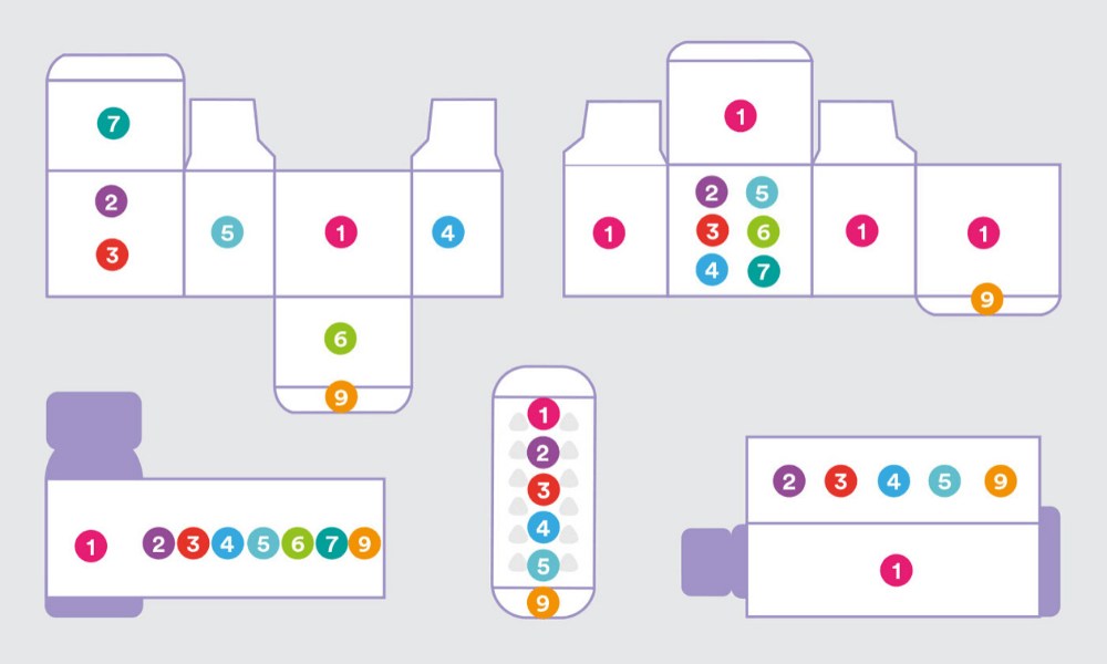
After the familiarisation phase, we defined our approach and created three innovation tracks. The first one was the information design. Since we had a lot of content, we needed to understand how to handle it, what the information architecture will be, and how we will logically group information. The second one was the visual design. Once the information is handled, we needed to have a layer of visual design to represent that information. The third one was the workflow design for deployment. We had to deliver a comprehensive system because some other team sitting 1,700km from the studio was going to use and replicate it on different forms of packaging. And these formats vary immensely — small injection vials, a strip of 10 tablets, half-litre bottles, external cartons, et cetera.
To begin, can you take us through your process of information design?
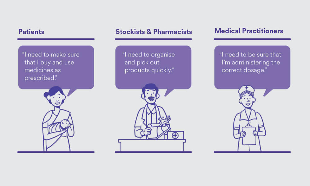
You can’t do information design without defining who you are designing for, because that information is for someone [to consume]. We identified three key user sets — patients, stockists and pharmacists, and medical practitioners. Then, we defined the primary needs of these user sets. This would mean purchasing and using drugs as prescribed for the patients, and, for stockists and pharmacists, organizing and identifying products quickly. It’s also important to know who the primary user is. For a box containing 20 strips of medicines, the primary user is likely to be a stockist and a chemist, because a patient doesn’t usually buy in bulk. Based on the user types, the information was logically grouped and structured.
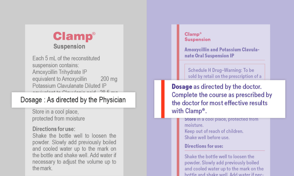
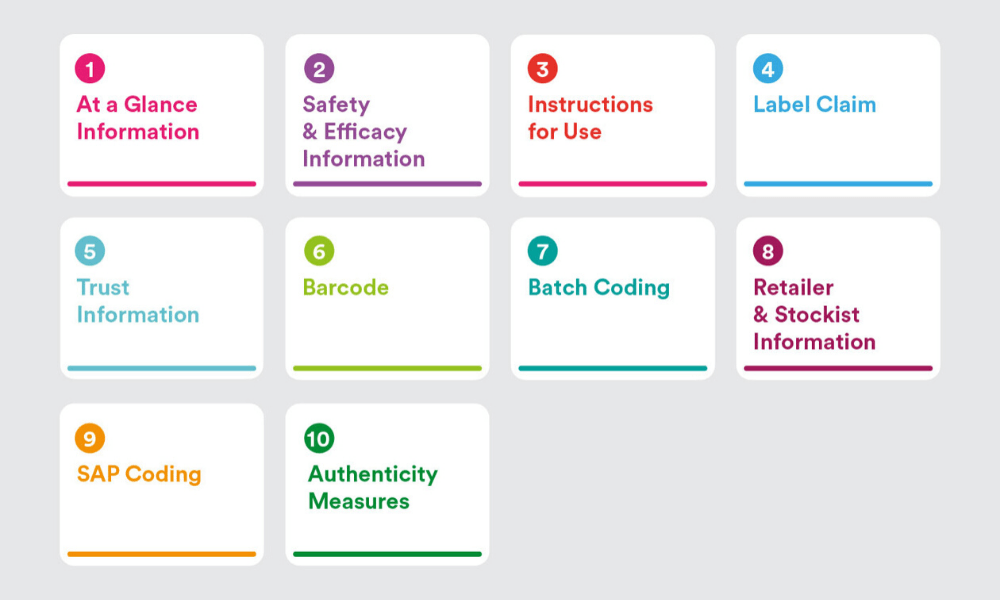
We also dissected every possible kind of information, and clustered them in logical groups. We came up with 10 such groups. This provided a structure for internal product teams to collate varying levels and quantities of information across product brands and packaging formats. Most importantly, it brought cohesion and structure to how information could be handled across a diverse portfolio. Apart from grouping and restructuring the information, we also touched upon the language and content. A lot of information was repeating. When we sat with the client’s team, we realized that over the years in this industry, adding information was safer than questioning the existing one and deleting it. If you change any word, you have to get the certification again. But for this project, the client pushed for some of our recommended changes since it made a strong case for bettering user experience. We made some changes to the content itself to reflect the patient-first philosophy and make it easier to understand. For example, changing “as directed by the physician” to “complete the course as prescribed by the doctor for most effective results with this medicine.”
What about the visual design?
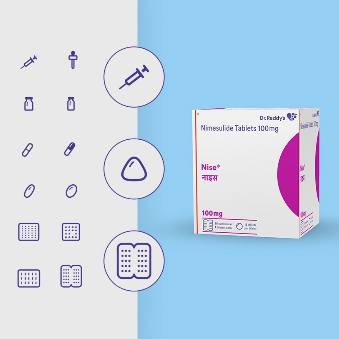
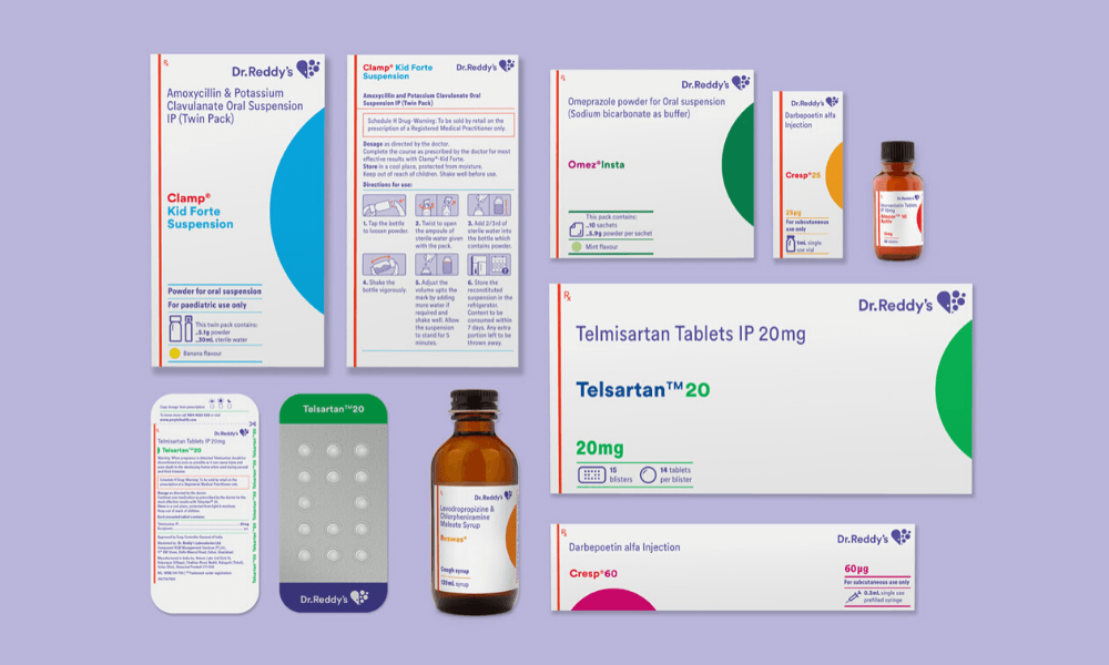
One of the goals of the redesign was to have high brand recall. This means that the visual design involved not just laying out the content in a meaningful and respectful way but also taking into account the new brand identity. We made sure that our packaging had a strong shelf throw in every size and format. We also observed that when chemists stock medicines on shelves, they don’t have enough time to ensure that only a particular side of the box will be facing them. So, we had to ensure that at least four sides of the packaging had the medicine name on it. We also had to make sure that there was enough visual distinction between different dosages of the same product. The visual design phase was like solving a complex puzzle. It was like a box inside a box of problems, and we had to solve every last millimetre of it.
There were macro issues, and then there were the micro-detailing aspects of the project. We took a lot of time to study the conventional way instruction illustrations were being used on medical packaging. For example — a medicine box contains two formulations, one is in a liquid form and the other is in a powder form, the end-user has to mix them in a certain way, shake it in a particular manner and then consume it in a particular time frame. And we had to communicate all this in an area of 7 x 24mm. Plus, these instructions are designed for people who have limited or no literacy. This was an extremely challenging task. We were designing them on large screens, then printing them at the size they will be used, and checking if they are easy to decode. We also had to make sure that it could be printed using existing production methods. This is what we call the invisible craftsmanship. Nobody will know what has gone behind making that syringe icon, which is two millimetres tall.
Typography was another big challenge. We tried to use the brand font ‘Circular’ but it didn’t have a condensed version that would allow us to fit the dense information in the available area. So we talked to the client, and suggested commissioning the Lineto Type Foundry (who had made Circular) to make a condensed version. A new drawing of a condensed version was commissioned — and it helped us in tackling the space crunch.
And then comes the last and very important stage of this project, which is workflow design.
Tell us more.
In the same way we went to meet stockists and chemists et cetera, we also spent a considerable amount of time with Dr. Reddy’s in-house design team to understand their skill level, the flow within the department, expected timelines, and the internal chain of command for approvals. Once we understood that, we designed a workflow which started from identifying the packaging type based on primary user, and moving on to a step-by-step workflow with specifics of information and design handling accordingly. So what they are getting is a well worked out and relevant template but in a guided sequence that suited their internal processes. For us, it is equally important to consider what happens behind the scenes and what happens after we deliver the project. Is it going to be sustainable? Because if we created something great but it’s not sustainable, then it wasn’t the right solution.
We were happily surprised when we got the first pieces that they made after the orientation. Those were pretty accurate. For us, that was one marker of knowing that this system has worked. Dr. Reddy’s also decided to take this system and implement newer brands and products. This was considered as the benchmark to create similar adaptations for other markets too, which is also a good indicator that this design solution performed well.
I have observed that projects like these do not get talked about enough in the design industry, in comparison to the simpler projects. Why do you think this is the case?
Our theory is that people hesitate to like or love projects such as these simply because you can’t like or love it before understanding it and people don’t have time to read more than 500 words — people don’t even read captions these days. It is concerning. On the other hand, by not documenting them well or by not talking about it enough, we do not pay due respect to such projects. We also need help from the mainstream media. They should also be on the lookout for behind-the-scenes stories of such projects rather than just talking about the output. Informed and meaningful design, especially when we talk about design for India, may not always come with bells and whistles and ‘markers’ of what we call out as identity. Change through design can often be silently potent. We just need to look closer.
Author
Kawal Oberoi is an independent graphic designer, brand consultant and podcaster. He is on Instagram and Twitter at @thekawaloberoi.


