

You’ve encountered Helvetica. Variations of the font have been used liberally — you may have spotted it on the Jeep logo, across the subway system signage in New York, and even (briefly) as the default option across Apple devices. It’s a font that has its own film, and now, it’s back in the spotlight — Monotype, an American company that makes fonts (among other things) and which currently owns the licensing rights to Helvetica, has given the popular typeface a new upgrade.
Origin Tale
When Helvetica was born back in 1957, san-serif typefaces were having a bit of a moment. Originally created by designers Max Miedinger and Eduard Hoffmann in Switzerland, the typeface found passionate fans (and foes) across the world. In a marketing plan akin to sending free goodies to social media influencers, popular Swiss graphic designers were encouraged to adopt the new font. It was an easy sell — post-war designers wanted a modern-looking, neutral typeface, and Helvetica delivered.
Soon, Helvetica grew from a letterpress font (for which every character needed to be a physical object) to embrace new printing technologies. The font was modified slightly to fit these new systems over and over again, at the cost of its original design.
In 1983, one of the font’s first planned redesigns led to the release of Helvetica Neue. This new typeface made sense of all the variations and created a systemised type family for a digital age. It was a more accessible package, but there were design compromises made to accommodate its many styles, and some limitations from the analogue system carried over to the digital files. A big criticism was also that Helvetica Neue was too tightly spaced — it fit a lot of text in a smaller space, but the letters had no room to breathe. Still, its widespread use can be chalked to the fact that it was licensed by Apple and Xerox, and was available on Mackintoshes everywhere. This is the Helvetica that most users are familiar with and hold strong opinions about.
Fast Forward
We’ve come a long way since 1983. In the last few years, a number of brands, like Lufthansa and American Airlines, replaced Helvetica Neue with custom-made fonts in their logo — a possible prompt for the font’s redesign. Screens have become smaller, and their resolutions a lot sharper. Today, fonts aren’t just used by designers, and their application is extending to new media too. Helvetica Now is said to have been redrawn keeping all of this in mind.
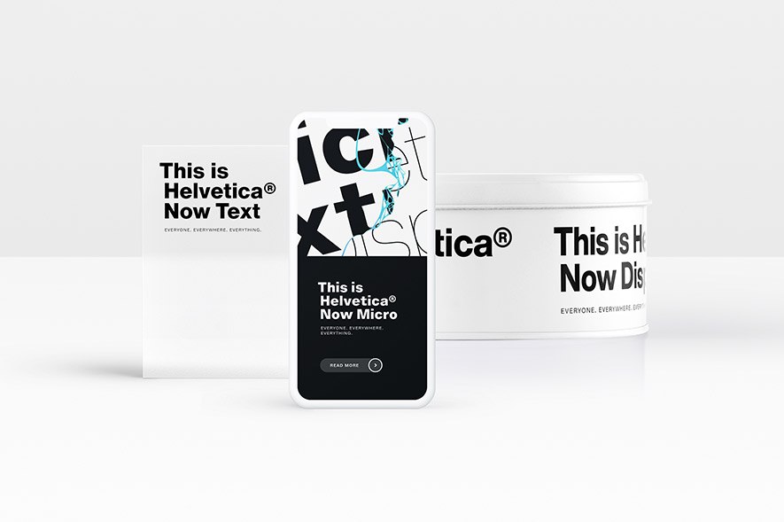
Helvetica Now is a bundle of three optical sizes — ‘Micro’, ‘Text’ and ‘Display’, named for the uses they are best suited for. What this really means is that the drawings of the letters are optical illusions — different when compared side by side but appearing the same when used at their intended sizes. ‘Micro’ shines at small sizes and is intended for the mobile, tablet and smartwatch. ‘Text’ is for a layout that involves large amounts of text, such as a newspaper, magazine or website. ‘Display’ is for larger impressions, like newspaper headlines and billboards. Clearly, a lot of thought has gone into the 40,000 characters the upgraded typeface family comes with — not only in terms of design but also with regard to who uses it.
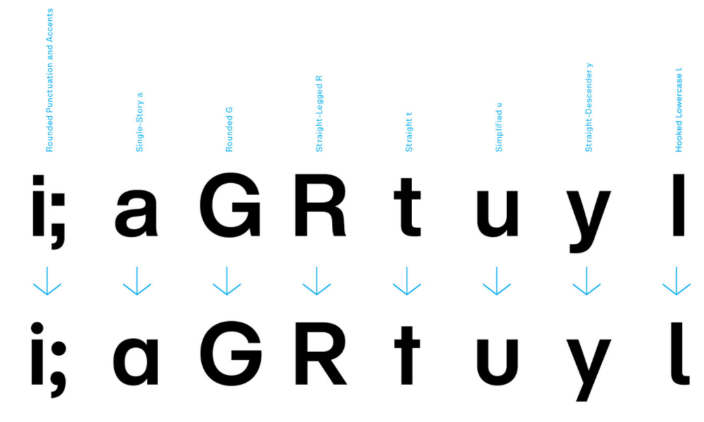
Some letters come with alternate designs as well. This lets the user toggle between a nostalgic design or choose a newer one. The iconic tail of the “R” now has an alternate design, which is a throwback to Miedinger’s vision. The lowercase “L” has a tail which helps distinguish it from the uppercase. The “t” , the “y” and the “G” have been significantly updated as well, but the originals are also available for traditionalist Helvetica-heads. Amid all these options, a question lies: Which design is the true Helvetica?
For over 60 years, Helvetica has been used extensively in communication — from maps and magazines to logos and street signage. The release of Helvetica Now indicates that this type system shows no sign of retiring anytime soon. The new design is definitely a step up from its previous iterations, and ready for the tech advancements the coming decades throw at it.
Author
Tanya George is a type designer and typographer based in Mumbai. She is on Instagram and Twitter as @tanyatypes.
Tell us what you think? Drop us a line.


