

With See This, we’re diving deep into our unabashed love for good design stories. Here, graphic designer Kawal Oberoi hones in on interesting and innovative visuals in our everyday surroundings, and chats with designers behind the work about details that may otherwise pass us by. Take note.
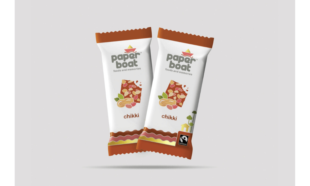
Paper Boat first showed up with its simple refreshing drinks in stand-up pouches on store shelves in 2012. Before it launched, Pune-based Elephant Design was commissioned to work on the brand identity, naming, product experience and packaging design for their range of drinks, which promised familiar tastes with a side of nostalgic childhood memories. Since then, the brand has expanded beyond beverages, and the collaboration between Paper Boat and Elephant Design has stayed. Here, Elephant Design’s co-founder and director Ashwini Deshpande, takes Kawal Oberoi back to those initial days to understand the studio’s thought process in creating a pathbreaking Indian beverage brand.
I remember the first time I saw Paper Boat products in the market, I instantly fell in love with the brand. Later, I discovered that Elephant Design had been instrumental in making Paper Boat the brand it is now. Can you tell us about the time Hector Beverages, the company that produces and markets Paper Boat, reached out to Elephant Design for this project? What were their expectations from you in terms of design interventions?
We were first approached by the Hector Beverages team in 2012 with an idea of launching a new Indian ethnic beverage range. The company already had some experience in the beverage industry as two of its founders — Neeraj Kakkar and Neeraj Biyani — had worked with a large multinational. Their team also had substantial business experience in terms of distribution, marketing, and brand building. They knew that the task of naming, packaging and branding a product was serious business and that it can be the real differentiator. They had done their homework on us, so they had a lot of trust in what a design intervention from us could do for their business.
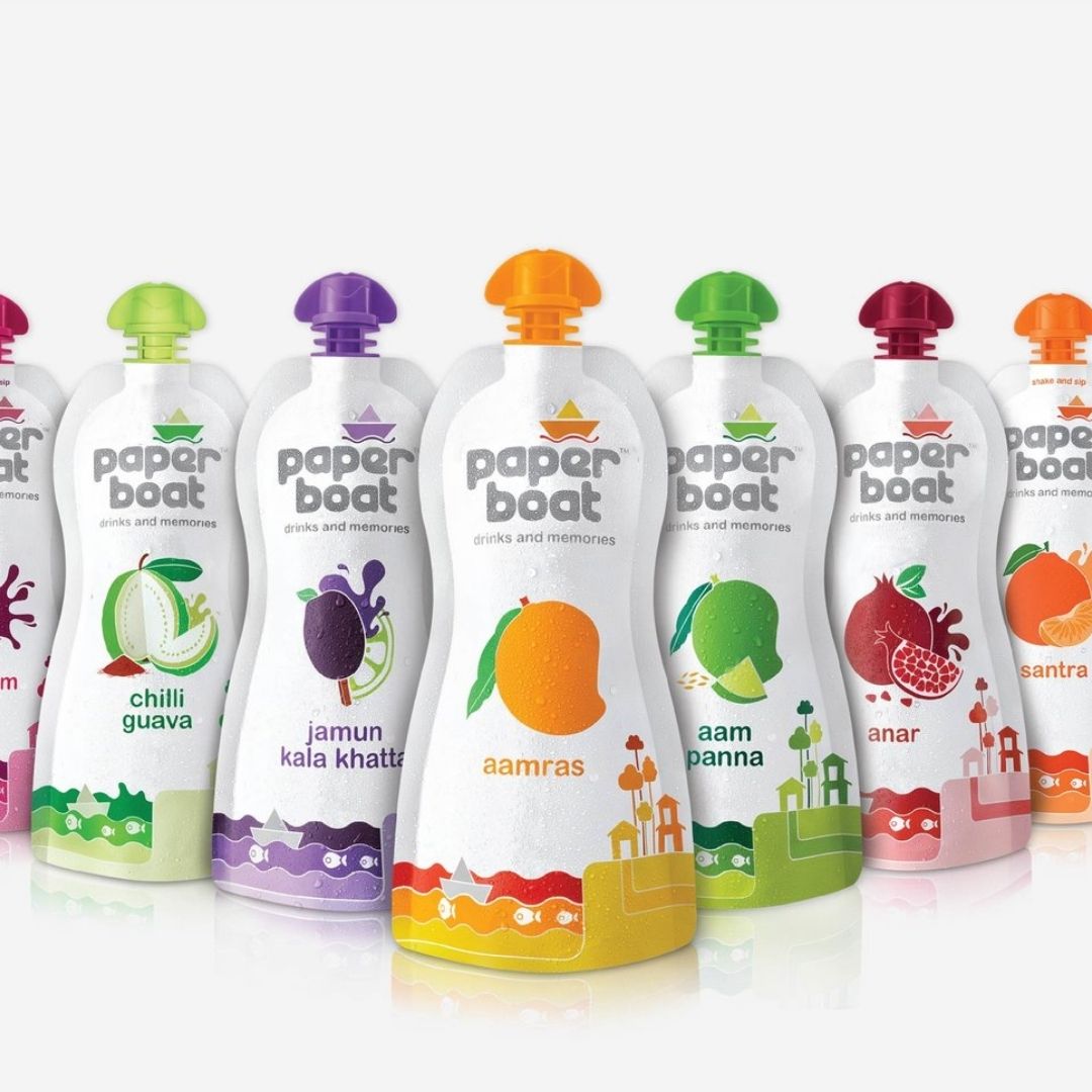
In terms of products, they had decided to launch three ethnic recipes — aam panna, jaljeera, and aamras. These drinks were as rooted in Indian habits as you can get. They taste amazing and have natural ingredients if made with traditional recipes at home. But due to multiple reasons, it is impossible to get those drinks in today’s day and age. Firstly, you can’t get the right ingredients. Secondly, you don’t know the recipe well. Thirdly, you don’t have the time to make them. And if at all any of these drinks are available at a roadside cart, you’re bound to be unsure about the hygiene. Hector Beverages had the perfect recipes and sourcing in place. Therefore, on the product side, they were very well sorted.
Paper Boat is a brand with a strong emotional connect and that adds to their product experience. What was the client’s brief on the conceptual side of the brand?
While briefing us about the project, they told us about an interesting fact, that all of us have something called ‘limbic imprint’ in our brains. A limbic imprint is made up by our own encounters and experiences and is also passed on through genes. It remains dormant in our mind as a positive memory linked to specific experiences. When something similar happens, let’s say you either get exposed to the same ambience, aroma, visual, taste or other stimuli, you get a positive feeling again. You reconnect with yourself. They told us that they wanted to create a brand that evokes people’s limbic imprints. Now, that’s a unique brief! They were not talking about marketing or competition or square centimeters of the packaging. And when you have a differentiated brief like this, there’s no competition because nobody else is thinking like that.
Further, they pointed out that the brand was primarily for people who wanted goodness back in their lives. Kawal, you and I might be able to relate since we come from relatively smaller cities with a simpler lifestyle. When we move to big cities for work, all relationships feel transactional. Nobody has the time to build deeper relationships. Urban life is full of stress, competition, overcrowded spaces, pollution and all kinds of difficulties. What’s the respite? What do you seek in those times that will take you back to the happy place you grew up in? With Paper Boat, we wanted to create that happy place.
What’s the story behind the name Paper Boat?
Since our idea was to recreate the optimism and positivity that existed when life was simpler and non-transactional, we asked ourselves — when did we have that life? For most of us, it was during our childhood. When we were young, life was simpler, happier, and we had smaller aspirations. That’s how we started ideating on the name. We jotted down the things we used to do as a child. I reconnected with a popular ghazal written by Sudarshan Faakir and sung by Jagjit Singh — “Woh kagaz ki kashti, woh baarish ka paani…” It’s about how we used to launch paper boats in puddles with our friends, and how we relished grandma’s stories, and how life was beautiful during our childhood. That song led us to the word Paper Boat, and that’s how we suggested this name. It was a very cheeky thing to do for a beverage brand, but the client was exceptionally receptive and trusting. I feel it was a bold step from their side to go with a name that did not talk about the taste, juiciness, fruitiness or other traits of the product. The name just talked about brand ethos.
In hindsight too, that was a great decision. Let’s say we went with a name that suggested fruitiness and we talked about the fruit pulp concentration? If someone launches a product with more fruit pulp, it’s over. Let’s say if they decided on a brand name that suggested freshness of fruit or taste or fruit content or vitamins and minerals, it would have been easy for another brand to compete by doing similar or more of that. We had to leave this competitive environment. For a start-up with a limited budget, the brand name had to be based on emotions and not on the function of the beverage. Because emotion is hard to own and replicate.
When Paper Boat hit the market, nobody else was using the packaging of the kind they were using. Their pouches create a tactile experience for the consumers. How was that packaging conceptualized?
The Hector team had already decided to package the drinks in doypacks, which are stand-up pouches without a gusset. This decision was based on their manufacturing and distribution potential. But what helped convince us about the pouches over anything else is the fact that these packages take lesser space for transportation, especially after consumption of the beverage. An empty doy pouch collapses and hence its volume decreases massively, which isn’t the case with a bottle or a tetrapack. Flexibility of doypacks save a lot of fuel as they take up negligible space for transport compared to other formats.
After finalizing the type of packaging, we started ideating on the shape of the pouch. Since our idea was to touch people’s limbic imprints, we recalled how we used to enjoy fruits when we were kids. We tried to emulate the way we used to suck the pulp from fruits. There’s a sensorial feeling to that experience of holding and squeezing a fruit. We challenged ourselves to bring that experience and ergonomics to the doy pouch. That’s how we got the current design of the iconic Paper Boat packaging. Even an adult in a suit and blazer feels like a child while drinking a Paper Boat drink. We also designed a cap that was inspired by the shape of an actual paper boat and was ergonomically suitable for ease of opening. The cap shape enhances the iconic stature and ownability of the pack.
What about the packaging graphics?
Just the way we designed the cap and the pouch with intent, we decided that the graphics should be simple, uncomplicated and such that anyone should be able to draw them. We created a logotype with a soft form that gave a feeling of warmth and goodness. We decided that the colours should emulate nature, so we refrained from using synthetic or glossy-looking colours. Since the brand’s name was Paper Boat, we wanted to achieve that matte paper-like finish which was made possible due to enthusiastic support from PPL (the printers). In terms of visuals, we didn’t go overtly traditional or conventionally Indian because we were creating this brand for today’s youth and the definition of being Indian is ever-changing. We believe you don’t have to make it a ‘Horn OK please’ kind of kitschy or use paisley patterns and rani pink to make it Indian. That’s a caricature of Indian-ness. Look at you and me, for instance, we don’t necessarily wear traditional Indian clothes, but we are Indian because our value system is rooted in Indian culture. We took that same approach with Paper Boat.
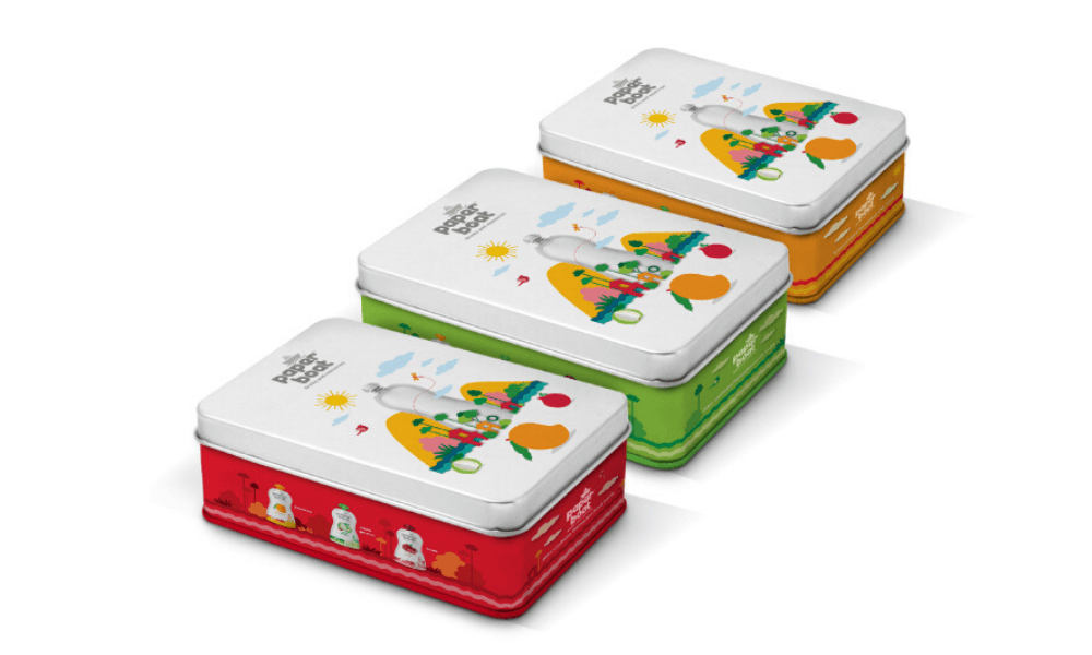
The tin boxes launched by Paper Boat have become quite popular. I have seen them being upcycled by many people for storing things. How did you come up with the idea to create tin box packaging for the brand?
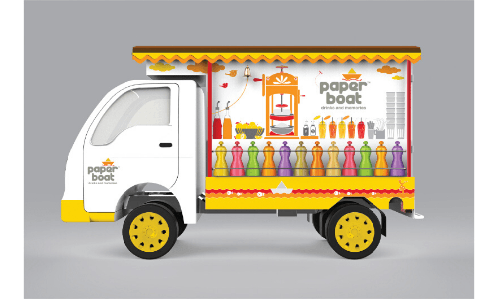
We Indians are hoarders. Whenever we get gifts in tin boxes on special occasions, we repurpose them to keep our knick-knacks. So we asked ourselves, if people are already hoarding these, why not give them new hoarding devices? That’s how the tin boxes happened. The first tin box we did was for a limited edition thandai gift pack for Holi. We asked ourselves what story we would like to tell through the packaging graphics, and we looked to popular culture. There’s this song about Holi in the popular movie Don, starring Amitabh Bachchan. That song features a pot-bellied man who serves thandai with bhang to the protagonist. We decided to use him as a reference for the illustration we created on the box. For anything we do for Paper Boat, we always try and reach out to inspiration from our memories. When we were designing delivery vans for Paper Boat, we took inspiration from the baraf ka gola carts and used them as an inspiration for the entire experience.
Paper Boat also has a strong presence on social media platforms. I have seen people repost and share Paper Boat’s content, even if they’re not a consumer. Did Elephant Design have a role in social media content too?
For the longest time, Paper Boat has been entirely dependent on social media for promotions. Although we didn’t create all the social media posts and illustrations. They had various freelancers, agencies and in-house resources doing it for the brand. Staying true to the brand, they try to touch upon the happy memories of people. It’s been a great run for them through social media as well. We complement the stories through packaging and other collateral. And each time people read the stories on the packaging, they say “Hey! That happened to me.”
Author
Kawal Oberoi is an independent graphic designer, brand consultant and podcaster. He is on Instagram and Twitter at @thekawaloberoi.


