

With See This, we’re diving deep into our unabashed love for good design stories. Here, graphic designer Kawal Oberoi hones in on interesting and innovative visuals in our everyday surroundings, and chats with designers behind the work about details that may otherwise pass us by. Take note.
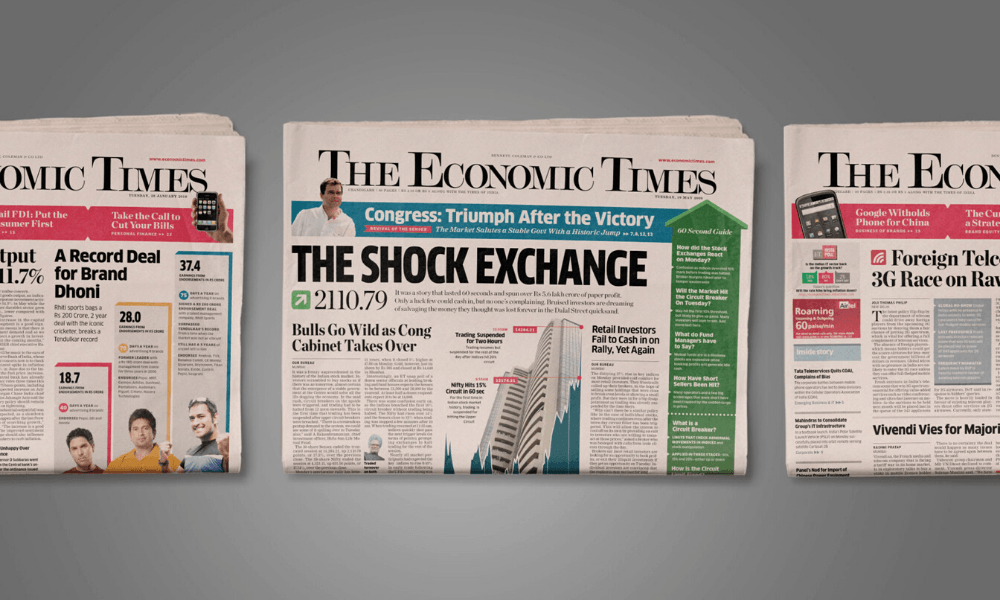
First published in 1961, The Economic Times is one of the world’s most read financial dailies. For a long time, the newspaper shaped readers’ understandings and expectations of the category. In the 1990s, it pioneered the introduction of non-business content. Over the years, in response to the rise of competitive options in the market, the Times’ team introduced changes that were meant to attract first-time readers. These were decisions that were often made on the fly, without a holistic plan. In 2011, Itu Chaudhuri’s design firm, Itu Chaudhuri Design, was brought on board to redesign the paper. Here, the graphic designer takes us through their strategic design process.
‘The Economic Times’ (ET) is a highly successful Indian financial newspaper, arguably unbeatable in that genre. Was there some discontent that made the ET team want to pursue a redesign?
We have always struggled with discovering why clients want to use design in their situation. There tend to be vague hopes from the redesign process. Yes, there’s discontent, but it’s a very diffused discontent. In an organisation, different people have different interests. It isn’t easy to get people to say what they’re trying to get done because it’s a diffused set of reasons.
In the case of the ET design, we spent days trying to surface their concerns, and it turned out that their worry was not an immediate one but a future concern, illustrated by other newspapers like Mint. Mint had punctured the idea that there was no challenger to The Economic Times in the pink paper space. In terms of circulation, there was no challenger, but in terms of readership, there might have been. I think the growing readership of Mint got ET worried. And somewhere, someone let slip that not enough younger newspaper readers — i.e. people who were just entering the newspaper readership — were choosing The Economic Times. The concern was that younger people were willing to experiment with other papers, and Mint was among their top picks.
What was your reaction to their concern, and what direction did you suggest for the newspaper in this scenario?
Once we got that input, we were able to tell them that we don’t have to worry about the youth per se because there isn’t such a thing as the ‘youth’ as a category of reader to respond to. I tend to be suspicious of that idea — sure, there’s a demographic called ‘millennial’, but it’s not like everything is unique about them. So, if you make a paper that young people can read, you’ll find that you don’t need to create another paper that older people can read. Moreover, when you’re talking to an audience like the readers of ET, people are not reading it to be in ‘youngistan’. You should make an international-looking paper that’s contemporary in appearance and tone, which can also look ‘senior’. The young reader of The Economic Times is typically studying economics or management in MBA colleges. They usually look up to the people with grey hair, in suits and ties. All they want is to be treated like a contemporary newspaper reader.
In Team ET’s attempt to make it feel younger, the newspaper had become noisy and chaotic over time. They tried to introduce things like cartoons, caricatures and other fun elements. Perhaps they went too far trying to prove how much fun they were. In my opinion, if you write a smart headline that people will like and you say that in a typeface that is suitable for reading in a newspaper, the job is done.
Once everybody agreed with that idea, it was more or less the regular agenda of cleaning up the newspaper design without really changing its news presentation style. Every newspaper has a style, which can be sensed in its tonality, how they prioritise the news, their stance towards the reader, et cetera. From the design standpoint, the response eventually comes down to typography.
The low hanging fruit was that ET didn’t have a proper headline typeface. So, to get the emphasis, they just made headlines bigger and bigger — and the more you shout, the louder you have to shout to be seen as shouting. Just like in a noisy room, you have to shout to make normal conversation. If you don’t have a gradient of tones, we can’t hear correctly. So, we solved that by suggesting better type choices. It helped us generate a very pleasant-looking newspaper with a lot of white space.
But the client wanted us to go a bit further, so he asked us to show them how we could pack the most content into the newspaper, without sacrificing legibility. We had to find a balance between the economy and the legibility of the content. It required a lot of critical measurements; to make a case for typeface A being more economical than B, we needed the numbers in the actual use context, with similar levels of legibility. That’s what occupied our first month of work.
After this month-long process, what were the final typeface choices that you suggested as a solution?
Eventually, we found the newspaper body copy champion — it’s a typeface called Nimrod. It’s champ for a reason: it’s not what you might call beautiful, but it performs exceptionally well in giving you a legible and highly packed use of space. Along the way we discovered some interesting spatial features (vertical economy matters more than horizontal) and that a large perceived reading size has a psychological dimension to it. That’s a more technical conversation for another time.
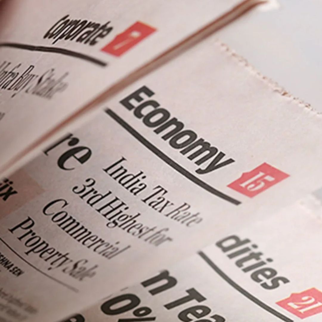
Then came the headline fonts — Chronicle and Clan. The Chronicle font family looks very much like the typical financial newspaper choice. (Hoefler Co., its designer, describe it as ‘a blended Scotch’, another typographic in-joke, because Scotch refers to the class of lettering it belongs to.) Clan was an interesting choice of sans serif, with a very contemporary flavour. Together the two typefaces create contrast and allow for a much-needed dynamism on the page because The Economic Times isn’t meant to behave like a buttoned-up financial newspaper. So this is where a brand personality meets the design layer.
Apart from the typographic choices, what were other big ideas in your design solution?
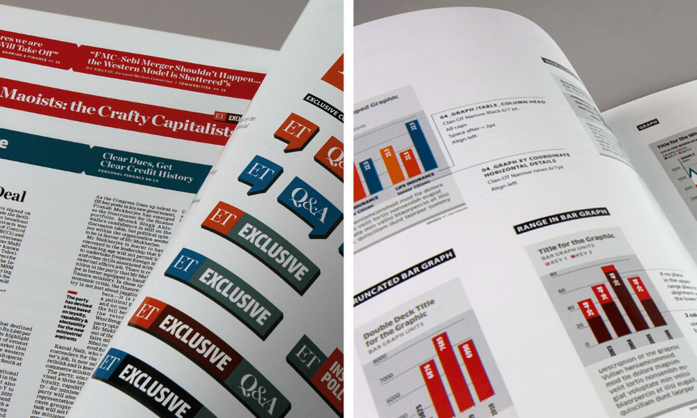
The other innovation that we made was that we developed a library of icons, a little bit like emojis you could say. They were meant to be used in headlines as communicative devices, in both ‘straight’ or ironic ways. Imagine putting a heart icon inside a headline on the politics page, which says ‘Congress and BSP are cosying up’. It’s very much the kind of cheeky thing that ET would do, and it matches their saucy, often colloquial headline style. We thought they’d overuse them, but they ended up underusing them.
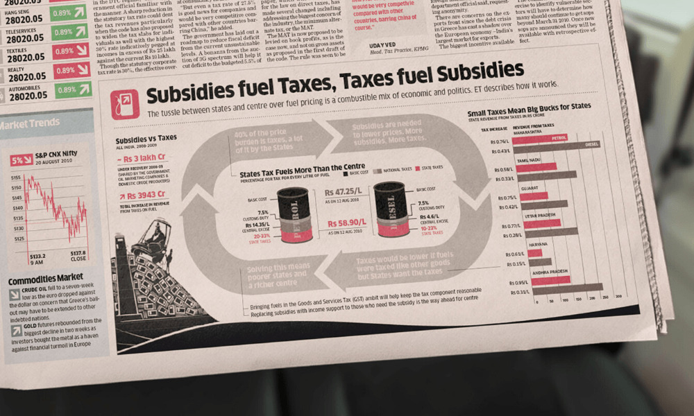
Another thing that we tried to do is to get rid of pictures from the graphics, i.e. to eschew pictures which are not conveying any information. For example, if there was a story about gold prices, they would put a few gold ingots or coins, or for forex, they’d put a few shiny dollar signs. I call that junk.
We explained how pictures, cartoons and illustrations need to get the reader’s attention towards the point it’s making. It’s like a visual magnet. Graphics are interesting, but the news is also interesting, and both deserve respect.
And the graphics become better if you stop dumping data and leave it to the reader to decode. Instead, you interpret it and present the conclusion in the headline of the graphic. The graphics have to be created like a story. It’s a piece of journalism.
The human issue is to coach designers and the people on the desk who make these graphics, something they are not yet ready to accept. We tell them that if you’re making a graphic, you’re a journalist.
Finally, there was all kinds of common-sense hygiene, like imposing colour schemes and order, et cetera, in a systematic way.
How did you deliver that as a system?
We delivered the system as loads and loads of page templates. Each page was worked out in conjunction with the people in charge of the page. We created templates with variations and grids, along with extensive documentation. We also created a 150-page user manual with everything we anticipated they’ll need.
What was the most significant difference that you found in newspaper printing, and how did you navigate that?
One of the things we were doing was that we were using laser printers for our test prints, but newsprint behaves differently. The typefaces are designed with a specific density in mind, but in newsprint, the ink spreads, and the whole page looks denser than it does on screen or on a high-resolution laser printer. So, we produced high-resolution scans of their printed pages, and compared them with our screens to gauge the amount of ink spread. We could fix that in our software by applying a stroke of a few thousandths of an inch (a unit called thou in engineering) around the typeface.
I keep hearing that print is dead. And that newspapers are going out of circulation as most of them are shifting to the web. Do you think newspapers will stay relevant in this age of digitisation?
Do you know the Lindy effect? Well, it’s a pop theory that says that if something has been around for a hundred years, then it will be around for another hundred years — the longer something has been around, the longer it will stay.
Print done right is a fabulous thing. It does something which digital will find very hard to do. The great thing about print is its inflexibility, that it cannot be customised, which is the opposite of the digital medium. In the digital world, you get the very thing that you look for. You search, you find what you search for or an algorithm gives you more of what it sees you looking for.
But what you don’t get is the beauty of mass media — that you don’t know what is coming to you. It’s the fresh stimulus that will never come if you’re searching for it.
Author
Kawal Oberoi is an independent graphic designer, brand consultant and podcaster. He is on Instagram and Twitter at @thekawaloberoi.


