

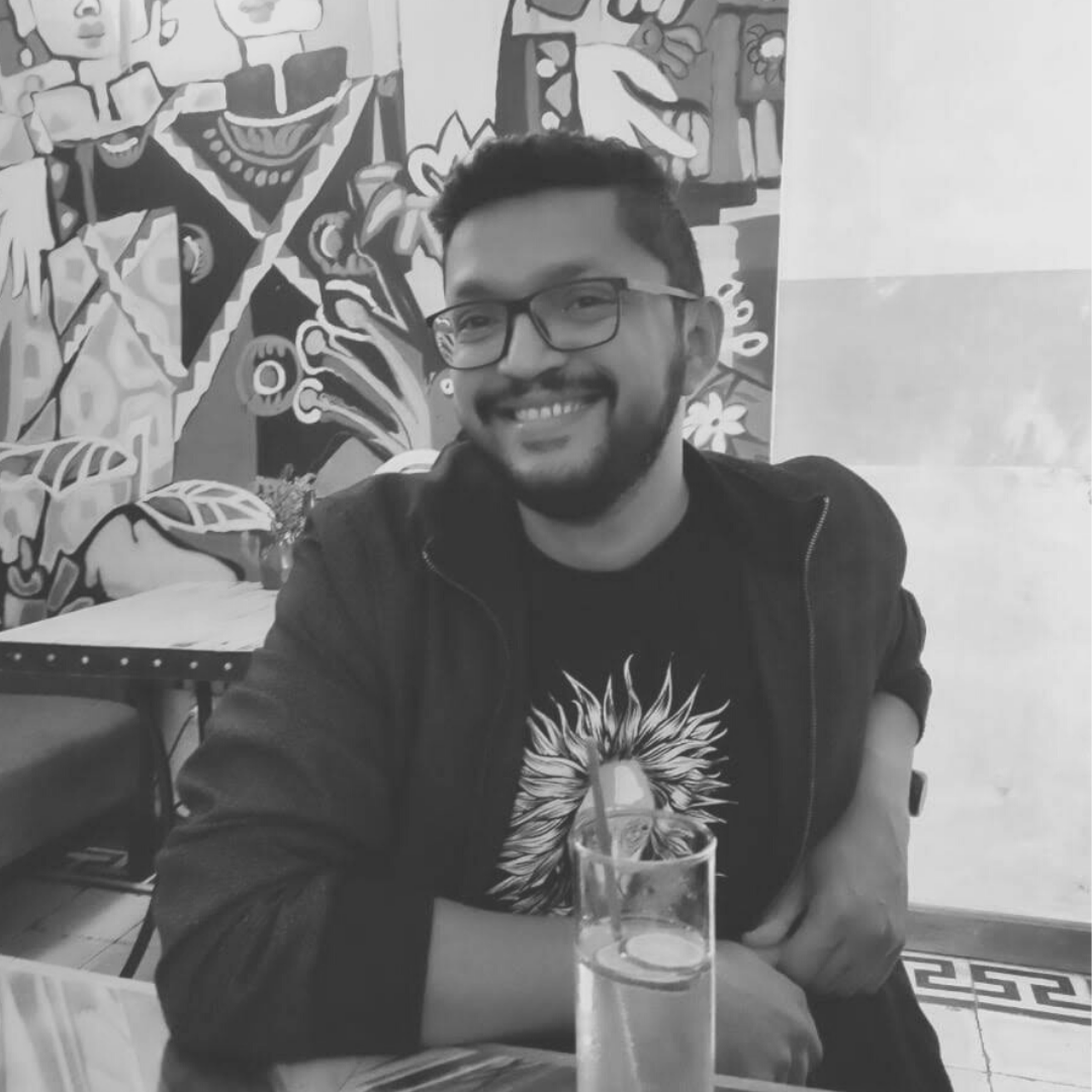
Comic-book letterer Aditya Bidikar has designed letters for comics such as Assassinitas, Grafity’s Wall, and Isola among others. Along with fellow “comics fan, comics critic and comics professional” Hassan Otsmane-Elhaou, he hosts Letters & Lines, a podcast discussing the inner workings of comics from structuring them in grids to the use of dialogue and questions of productivity. Here, Bidikar tells us how he went about swivelling from being a writer of comic books to a full-time letterer, the technicalities of type design for comics, and how film posters from long ago have been one of the many influences that shape his work.
What are you currently reading? Is there a work of writing you frequently revisit? What are the comics you’ve recently read?
As far as comics go, I just finished reading Ryan North and Albert Monteys’s excellent adaptation of Slaughterhouse-Five, as well as the phenomenal Peplum by Christian Hincker. On the lighter side, a friend recommended the recent Superman’s Pal Jimmy Olsen series by Matt Fraction and Steve Lieber, which is absolutely hilarious.
In prose, I’ve been making my way through Behind the Beautiful Forevers by Katherine Boo, about the Annawadi slum in Mumbai, and The Starry Wisdom, a collection of short stories inspired by H P Lovecraft, which includes the original prose version of Alan Moore’s The Courtyard. I’m also re-reading The Picture of Dorian Gray as reference for an upcoming comic I’m lettering called The Picture of Everything Else, a sequel from Dan Watters and Kishore Mohan, which follows the story of Basil Hallward, the man who painted the original portrait. Finally, I cannot help but mention Ruth Ozeki’s A Tale for the Time Being, the best book I read this year.
I think the two comics I revisit most often are City of Glass and Watchmen, both of which were early influences on me and a big part of why I ended up working in comics. In prose, I end up re-reading a lot of Terry Pratchett — it almost doesn’t matter which book — because the joy he takes in language and human character shines through in each and every one of them.
How did your interest in lettering for comic books emerge?
I originally became interested in comics as a writer. I had been writing prose for a very long time. City of Glass in particular — being an adaptation of a novel — made me realise that there was a lot to be accomplished in comics as a medium. I started lettering because I had no option but to letter the comics I wrote myself. I could neither afford to hire someone, nor did I know where to start, really. I stumbled along for a good while just practising for my own pleasure, until an Indian comics company declined to hire me as a writer but asked if I could do anything else. I said I lettered, but not professionally, and the publisher said, “Well, you won’t know if you’re good enough until you try.”
I still mostly thought of myself as a writer for the next few years. However, I kept getting better at lettering, and figured eventually that I actually enjoyed it more than writing — at least on a daily basis, and it became my focus. I did work for a (different) Indian company as an editor-cum-letterer for three years, but then took the plunge to work as a freelance letterer full-time.
For the reader to be immersed in the work and engaged with the plot ― or consumed by it ― what do you keep in mind whilst designing letters? For instance, in terms of the case or the weight, do the letters have to be robust or chaotic or lyrical or understated? How does the structure of the lettering affect the narrative, keeping in mind the many cultural, linguistic, and design decisions?
I approach this by thinking of myself as the final arbiter of the way a comic is being read. I could ruin the tone of a comic by using an inappropriate style which undermines the intention of the rest of the team. So I try to keep the overall tone in mind while I design the letters — respecting that tone while, in specific instances, either accentuating or undercutting it as needed in a particular case. I sometimes describe it as sound design, because people don’t realise that every sound they hear in most movies is intentionally placed during post-production, and depending on circumstances, sound design can recede or intrude, but it always helps to define the tone of the film.
As opposed to a logotype, for a type family you have to draw all the letters. What letters do you begin the design process with?
Type designers that work with text typefaces will tell you that they start with the ‘n’, ‘o’, ‘H’, and ‘O’ glyphs, because their anatomy helps define the rest of the typeface. But type design for comic books works slightly differently. Since you’re trying to emulate hand-lettering, you usually start with the letters that would deviate most from a standard-looking skeleton. For me, this is usually the uppercase ‘G’ or ‘S’, or if it’s a mixed-case font, the lowercase ‘a’ or ‘g’. Based on these, I can determine the way a pen should move to capture the same rhythm with the other letters. Sometimes the ‘R’ and the ‘Y’ can get quite fiddly, and most of my type design documents are littered with rejected instances of those letters, as well as the ampersand.
The balloon placement that navigates the reader through a page of a comic book and even across pages, guiding them from one scene to the next, is as important as the lettering itself. Do you approach the process of visual storytelling differently based on different genres of books?
The placement mostly depends on the artwork, because as a letterer, I’m collaborating with the artist to accentuate or play with the flow that they’re bringing to the page. But the genre and the overall mood of the story are definitely important in designing the look of the lettering — the typeface, the style of the balloons, the overall sleekness or roughness, all of these depend on the genre. I try not to have a one-size-fits-all attitude to any genre, because each book is a completely different animal, and needs to be engaged with on a different level.
How do you prepare to start working on new designs? Do you have a routine that you follow or is it a free-flowing process?
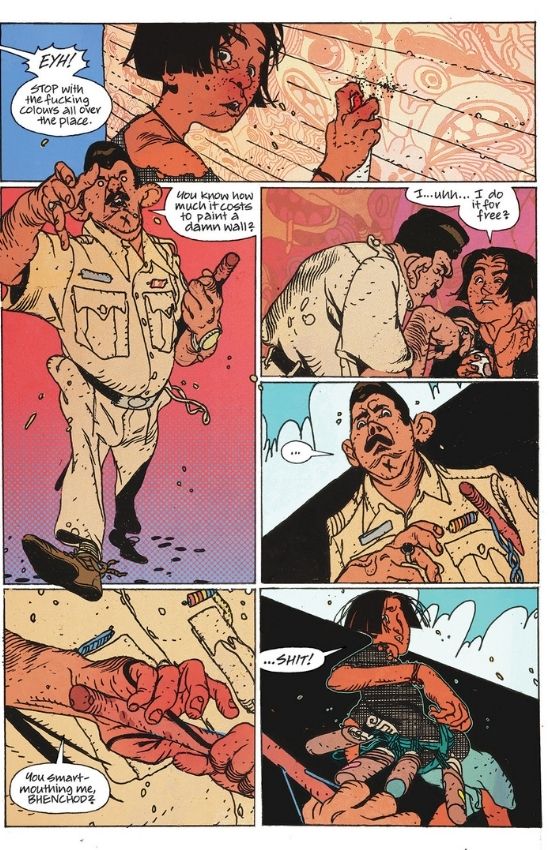
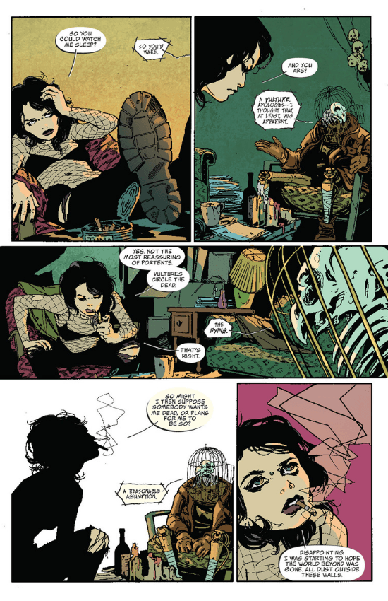
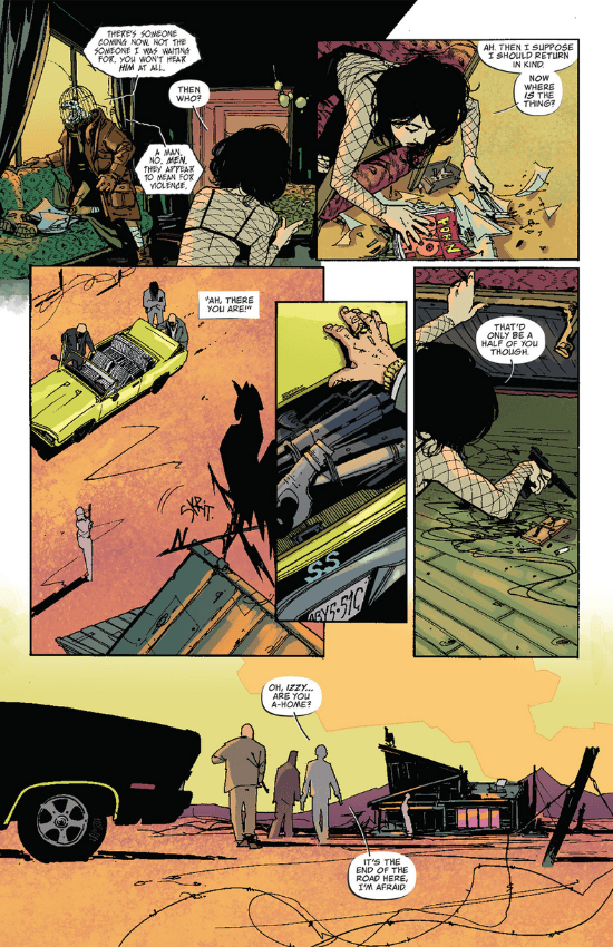
I depend heavily on instinct. Sometimes I’ll look at the first pages of a book, and I’ll just know what I want to do. For Coffin Bound, for example, I immediately thought of these unanchored balloons with a single line passing through them, and I never even tried to present other options as I was so confident it was the right idea. That’s rare, though. Most times, I’ll present the team with 3-4 options. I always take my cues from the artwork — the quality of line, the mood and the tone. I’ll work on successive options, starting from something classically readable, and ending with something that’s as weird and out there as I could make it. Sometimes the team will go for one of these, and sometimes we’ll mix and match fonts and balloon styles and come up with more. Usually we land on something within a couple of revisions, but I have at least three books on which we started at Style A and went on till Style M. You just keep trying something until everyone’s happy with it.
Have you designed letters with scripts other than the Roman one?
I did once assist another letterer of comic books who wanted to design a Devanagari typeface, but they lost interest in it pretty soon as it needed a ton of autoligatures to work. I’d love to work on a Devanagari comic-book font at some point, but frankly, I don’t know if the man-hours I’d spend on it would be worthwhile. On the other hand, some comic-book type designers have been creating fonts with Cyrillic and Japanese characters — that could be fun too.
You’ve also written and edited comics. Have you had readers come back and tell you that the characters from your work perhaps remind them of someone they know?
More than someone they know, I’ve had readers come back and tell me they didn’t realise other people had felt things they felt after seeing them depicted in my work. I don’t know if my writing necessarily explores interesting characters as much as tries to express a view of the world I’m hoping people will relate to. I remember writing a particularly dark story about someone obsessed with watching accidents take place (it was fiction, of course, but morbidity is quite human), that incited a few people to write me very angry emails because they couldn’t believe any person could be like that. However I take the fact that they felt moved enough to make this known to me as a compliment.
What was your experience working with DC Comics like?
It’s been really good! All of my editors have been a pleasure to work with, and schedule-wise, they’re a well-oiled machine, as one would imagine for a company that puts out as many books monthly as they do. Frankly, there weren’t nearly as many corporate-mandated rewrites as I’d expected before I started there. Plus, they like the fact that I don’t stick to one style, so I get to work on an interesting variety of stories and art styles.
Where do you glean points of reference for storytelling from, from a research perspective: via cinema, literature, mythology, or even newspaper clippings perhaps? Who were your early visual influences?
My first visual references were, no surprise, comics. I only really became interested in the visual aspects of storytelling after I got into lettering, but I’ve tried to make up for lost time after that. Apart from comics, a lot of pre-modern fine art is interested in storytelling, so that makes for a good reference point. I’ve had the good fortune to see paintings such as The Raft of the Medusa by Théodore Géricault, Liberty Leading the People by Eugène Delacroix, and Rembrandt’s The Night Watch in person, and they’ve affected me particularly strongly. I love watching trailers and title sequences from film and television, because they’re studies in graphic storytelling and condensing a narrative to as few images as possible. When it comes to typography, I love looking at old movie posters, especially from places more far-flung than the US and UK, because you often find people coming up with strange and interesting visual solutions. Honestly, I think posters from yesteryear Bollywood and Eastern Europe have given me more inspiration than other comics.
What do you think that drive or compulsion to keep making work is about? How important is it for you to break barriers and stand out, creating work that stands the test of time?
I think it’s all about doing the work in front of you. It’s great to have ambition and some kind of goal to work towards, but it’s vital to give your best to the thing you’re working on right now, to be as faithful as possible to what the work asks of you. Breaking barriers and standing out are about what other people are doing and what they expect of you, and it’s a lot more important to have an internal measure of the joy you get from doing the work itself. While you can’t control other people’s reaction to your work, you can control your own feelings about it. It also lets you have a balance between the work and everything else in your life, because as important as creative work is, the ‘everything else’ is just as important.
(Note: When you buy something using the retail links in our stories, we may earn a small affiliate commission.)


