

In her 2018 show, Nanette, Australian comedian Hannah Gadsby makes a case for the colour blue as a wonderful, inclusive one for all babies. Employing a slew of contradictory idioms, she explains, “Blue is on the cold end of the spectrum. But the hottest part of the flame? Blue. If you’re feeling blue, you’re sad. But optimism? Blue skies ahead! A blueprint is a plan, but if something happens not on the plan, where does that come from? Out of the blue…”
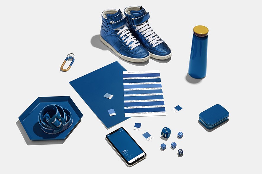
Cut to 2020, and colour institutions across the world seem to have a similar idea about the Colour of the Year (COTY), albeit without Gadsby’s humour. Over the past few months, we’ve seen the unveiling of Classic Blue by Pantone, Chinese Porcelain by PPG Paints, Naval by Sherwin-Williams, and most recently, Curiosity by Asian Paints. Each, a blue that alludes to a sense of refuge and revitalization, confidence and clarity. Much like every other COTY, it has design experts divided — opinions range from “A nice counter to the reality around us” to “I think it’s a travesty.”
At their core, colours embody the spirit of the times. Latika Khosla, a Colour Consultant who founded lifestyle brand Freedom Tree Design, recalls design of the 1950s, with its pastel and electric palettes. It was cheeky, glorious and fairly feminine — and a celebration of the end of World War II. All innovation was directed into home and fashion to attract women back to the domestic sphere, so servicemen could be rehabilitated within local industries. Then there’s Millennial Pink which, a few years ago, came to represent “post-prettiness.” And in 2019, IKEA designer Akanksha Deo’s India-inspired textile collection, Änglatårar, was marked by indigo — a colour, she explains, that’s come to stand for struggle in the country. It also has socio-political significance, seen with movements like Neel Bidroho, the eponymous farmer uprising of the 19th century.
Blue’s Clues
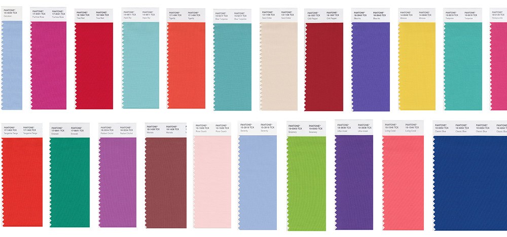
To borrow from Meryl Streep’s famous cerulean speech in The Devil Wears Prada, the COTY represents millions of dollars and countless jobs. Experts across the globe dip into their collective knowledge pool to predict palettes that will trend up to two years in advance. The resultant data is available to anyone willing to spend hundreds of dollars on it.
“Forecasts serve as relevant and contextual information for not only homemakers but also professionals. It’s an idea created by professionals so like-minded industries can use it,” says Khosla who is candid about the fact that colour follows the money. At the backend, it’s tech innovation that directs design trends within consumer segments in order to recover R&D investments. For example, Khosla points out, the metallic trend in cosmetics or home décor started with metallic-finished automotive paint.
Offering insight into the business-to-consumer aspect, Anubhav Gupta, founder of GPL Design Studio, Godrej Properties’ in-house design lab, says, “Businesses, especially retail, F&B and consumer goods, might study colour trends closely for insight into influencing moods, behaviours and choices. A change in colour scheme or shade becomes crucial to boosting brand positioning, bringing freshness and helping with a business’ marketing strategy to reach identified consumers.” Gupta, who is also the Zonal Head – Vikhroli and Chief CSR & Sustainability Officer, explains that in sectors like real estate, easy-to-maintain neutrals and pale palettes tend to have a wider consumer appeal.
In eyeball-grabbing, time-bound sectors like advertising and events, Visual Artist and Graphic Designer Mira Malhotra tells us that colour forecasting is crucial. “Design is disposable here. You don’t need it to be memorable for too long. You want there to be excitement for the new season,” she says.
Colour, Colour, Which Colour?
The early ’00s ushered in a more aware, trend-conscious consumer across the subcontinent and the Middle East. In India, this was preceded by the liberalization of trade in the ’90s that fuelled a consumerist spending culture, which until then was defined by one of frugality. Today, Khosla observes that colour trends, thanks to young, working women, have percolated down to small homes, with monthly family incomes of Rs30-50K.
Malhotra attributes the Indian consumer’s reliance on trends to our evolving design sense, one that’s currently inspired by the West. This is often reflected in companies’ safe, trend-savvy choices with visual communication. “If you don’t work with the trend, it could easily look like an old product. Colour schemes have a very big role to play and we do try to build it in, while also looking at the longevity the client wants,” she explains.
Conversely, interior designer Ravi Vazirani finds it hard to execute a colour-specific brief solely based on a trend. “Practices like mine don’t necessarily rely on colour trends. I like spaces to be timeless. There are times I react positively to a colour swatch and use it in my work. If it happens to be the forecast, good for it,” he says.
True Colours
The last decade witnessed the rise of data and analytics firms, like UK’s Edited.com, which employ artificial intelligence and machine learning to offer retailers real-time market data that traditional trend forecasts may not be able to pre-empt in the rapidly shifting social media sphere.
That said, the ephemeral nature of social media doesn’t necessarily tie in with real-life production. Khosla explains, “What has changed is the agility to present convincing stories [on social] around your offering. The production itself is not a shorter lifecycle.” Varied sourcing agents still have to coordinate on tech, material and volumes in order to be able to produce for the market at hand. Gupta also believes that future tech innovation could be a game changer, allowing consumers to modify the colour of, say, their car instantly to express moods and preferences.
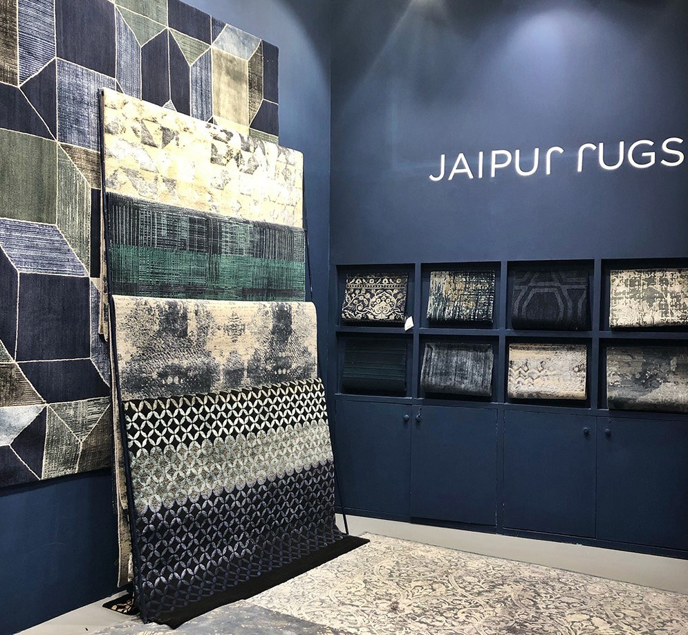
Testament to the success of forecasts are a host of products that precede or follow a COTY announcement. In 2016, Pantone’s Rose Quartz pick validated the Millennial Pink trend and the rise of the popularity of rose gold phones. At this year’s India Design event, Jaipur Rugs displayed a selection to match Pantone’s Classic Blue, and Sunil Sethi Design Alliance’s installation also showcased an eclectic array of products against the same hue.
All said and done, mindfulness is key. As Deo points out, a colour forecast needn’t necessarily work across segments, and it’s important for designers to understand application, relevance and cultural context before blindly adopting trends.
Author
Gretchen Ferrao Walker is an editorial consultant who has collaborated with Indian and international publications like GQ India, Forbes India, Time Out, Architectural Digest India, Design Anthology and Collectively.org. She is the former editor of travel bimonthly Time Out Explorer and current mum to a 2-year-old. She enjoys embroidering and making pictures.
Tell us what you think? Drop us a line.


